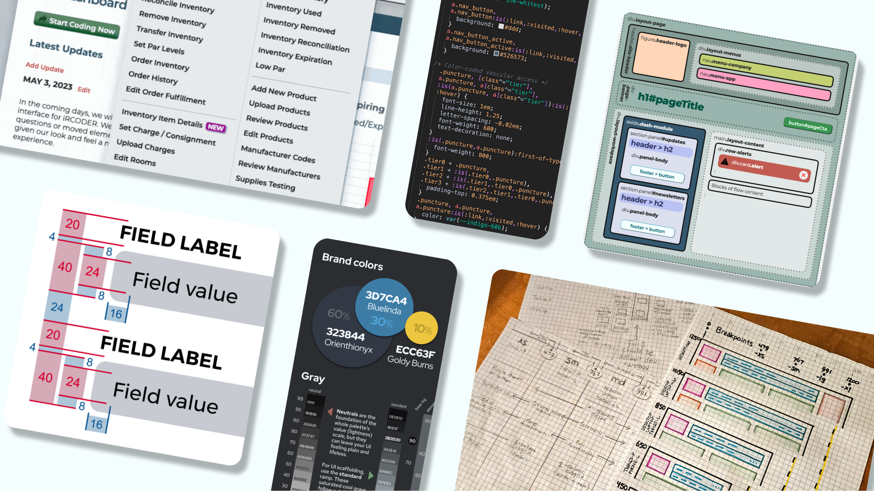
I designed, coded, and documented the first design system in this medical SaaS product’s 15-year history. I replaced fragmented UI decisions with reusable foundations, components, layouts, and production code that accelerated delivery.

See Figma slideshow
⚠  This case study is still under construction
Position
Design Director
Company
Medical Asset Management
Description
Coding and inventory SaaS for interventional and coronary hospital departments
UX
Process
Design System
UI
Product
Color

Medical Asset Management’s flagship application supports hospital teams responsible for coding procedures, managing inventory, and capturing revenue. The product was functionally mature, but 15 years of incremental development had left its interface inconsistent and difficult to extend.

As the sole product designer embedded with a C#/.NET team, I audited the implemented product, established its first design system, and carried that system from Figma into production HTML and CSS. The work reduced comparable UI delivery time by 75%, removed 40% of identified UI debt over 12 months, and created a shared language across design, engineering, and QA.

Problem

⇪ Back to Top | Next ⇨

A mature clinical platform had grown through 15 years of incremental development

The application had accumulated features across many releases, developers, and business priorities. Its clinical workflows were valuable and familiar, but interface decisions were made locally as individual features were built. No formal design function, component library, or front-end ownership model existed. Engineering focused primarily on server-side behavior, while UI decisions were often made directly inside individual pages.

[Asset: Product timeline showing the platform’s age, technical stack, and release constraints.]

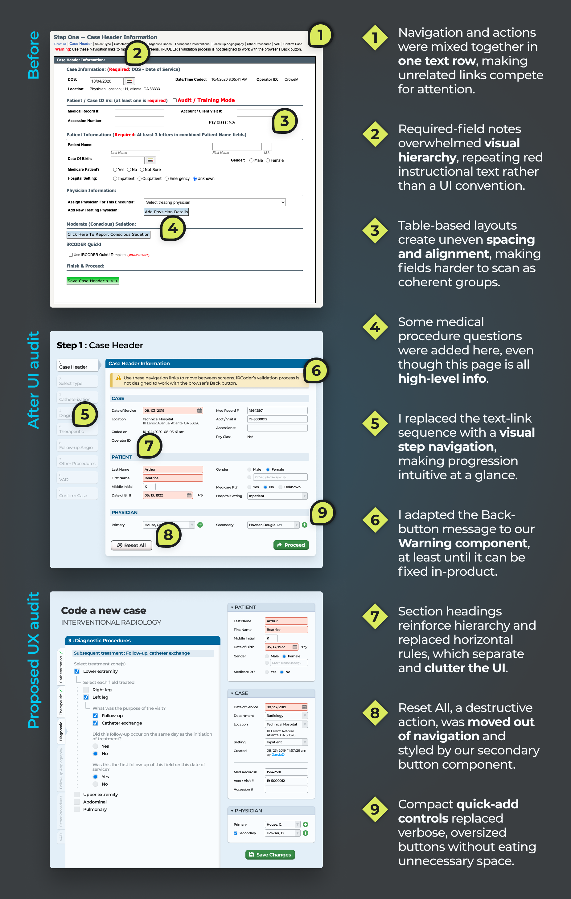
BEFORE: A typical screen UI pre-redesign

The interface had become inconsistent, brittle, and progressively slower to change

Typography, spacing, color, controls, language, and page structure varied across the application. Similar actions appeared differently, while unrelated actions sometimes looked identical. Table-based layouts, fixed dimensions, inline styling, and server-rendered markup made small changes difficult to predict.

Developers repeatedly rebuilt existing patterns, QA lacked a shared consistency standard, and users encountered changing rules across familiar workflows. The system needed modernization without disrupting a product hospitals relied on for time-sensitive work.

[Assets: Annotated legacy screen; inconsistent button groups; table-based form layout; verbose instructional copy.]

BEFORE: Bulleted marketing copy, written by Sales
BEFORE: Questions were often riddled with supplementary text that should not directly impact how the user answers, overwhelming cognitive load

insight

⇪ Back to Top | ⇦ Previous | Next ⇨

Why did routine interface work require so much engineering effort?

I inventoried production screens, CSS selectors, colors, typefaces, spacing values, controls, alerts, forms, icons, page regions, and recurring language. I also cloned representative markup and tested changes in browser DevTools. This exposed inline overrides, selector conflicts, server-generated elements, fixed dimensions, and aging dependencies that static mockups could not reveal.

[Research assets: UI audit matrix; raw CSS-value inventory; Jira issue taxonomy; examples of the same component implemented several ways.]

Repeated UI patterns had become a delivery problem, not merely a visual problem

Every one-off component increased design effort, engineering effort, QA scope, and regression risk. A system positioned as a visual refresh would remain optional; a system that reduced rework and ambiguity could become shared infrastructure.

Jobs to be done: When clinical staff complete high-frequency workflows, they need consistent behavior so they can work without relearning each screen. When developers build a feature, they need trusted components and guidance so they can assemble the UI without recreating foundational decisions.

Josef

Power User
Long-time expert who knows the system deeply but struggles with UI drift and lack of standardization.

Priya

Clinical Tech
Daily user entering procedure data, relying on clarity, consistency, and speed under time pressure.

Scott

Staff Developer
Spends too much time rebuilding redundant patterns and troubleshooting bugs caused by inconsistent markup.

decision

⇪ Back to Top | ⇦ Previous | Next ⇨

I treated the design system as delivery infrastructure, not a visual reskin

I considered three approaches:

  • Apply a cosmetic refresh to color, typography, and spacing.
  • Improve components opportunistically whenever a related feature appeared.
  • Establish a complete token, component, layout, and governance foundation that could ship incrementally.
Design tension: The interface needed to become more consistent and maintainable without disrupting workflows experienced clinical users already trusted.

I chose the third direction because it addressed both visible inconsistency and the process continually producing it.

  1. Preserve established workflows.
  2. Build reusable tokens, components, and layouts.
  3. Pilot the system on representative screens.
  4. Ship patterns through normal engineering review.
  5. Document components as they became production-ready.

The tradeoff was a slower visual transformation in exchange for lower implementation risk and stronger engineering adoption.

[Decision asset: Compare cosmetic refresh, opportunistic cleanup, and incremental system adoption.]

Jira ticket workflow, mapping how an item moves from design into the development queue

Solution

⇪ Back to Top | ⇦ Previous | Next ⇨

Tokens & Voice

I established shared tokens for a consistent look, feel, and voice

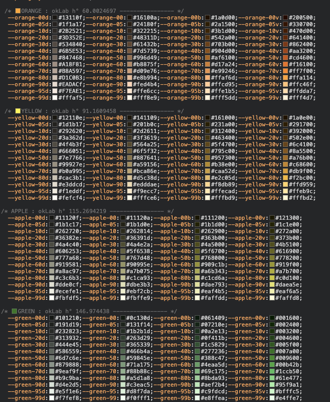
I consolidated the foundational decisions that had drifted across 15 years of development. Colors, typography, spacing, sizing, borders, iconography, and interaction states became reusable tokens rather than page-level choices. A four-unit spacing scale replaced arbitrary values. Five competing typefaces were reduced to one primary family with a monospace face for appropriate technical content. I developed the palette in OKLab and tested contrast directly in the browser to create more predictable relationships among hues and states.

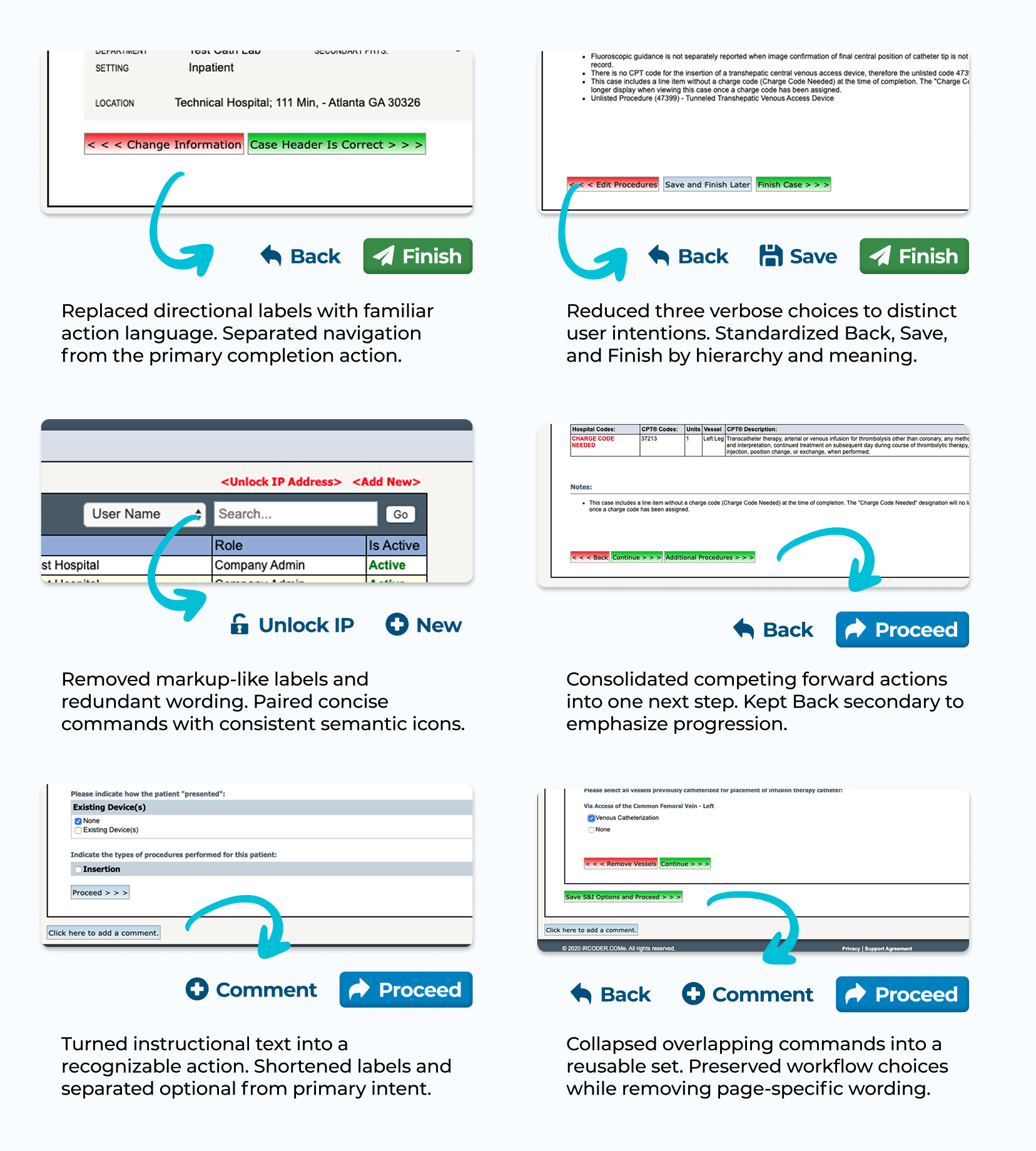
The system also addressed verbal tone. I simplified dense questions, standardized action labels, and rewrote alerts and errors to explain what happened and what users could do next.

[Gallery lead asset: Consolidated foundation board.]

[Caption: “Shared visual tokens and content standards replaced isolated styling and language decisions with one reusable product vocabulary.”]

Testing contrast across hues live in the browser. Every color is perceptually uniform in okLab.
A year prior to its inclusion in the CSS specification, I created what may be the first corporate UI color system based on the okLab colorspace.
BEFORE: One screen, four typefaces. The new system would reduce this to one brand face plus a monospace.
System error page. The mockup includes both old language explaining how to send an error report and a proposed link to easily bring that function to the surface.
Custom SVG icons drawn in Figma, replacing pixelated outsourced icons with one consistent style.
Questions were often riddled with supplementary text that should not directly impact how the user answers, overwhelming cognitive load
Elements & Components

I turned recurring interface elements into reusable components

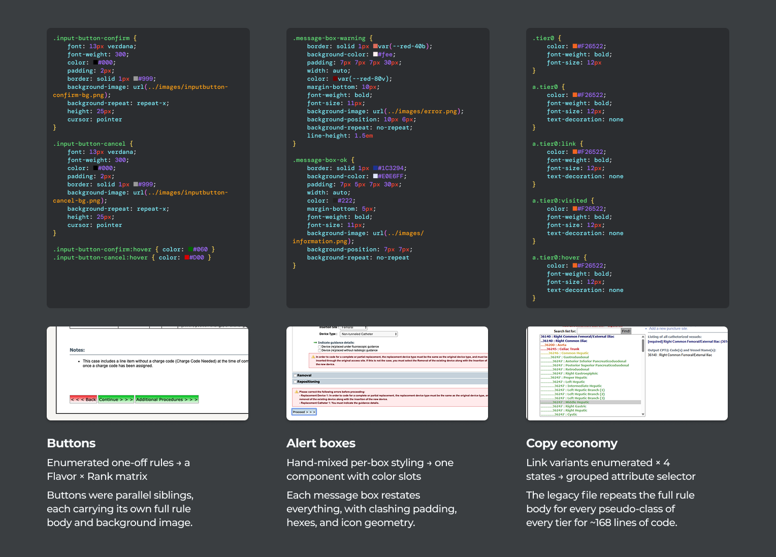
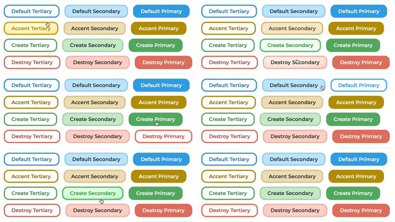
I audited buttons, links, icons, labels, fields, date controls, alerts, banners, and input groups. Button rules separated semantic purpose—such as default, create, accent, or destructive—from visual rank—primary, secondary, or tertiary. This replaced inconsistent action groups and gave teams a repeatable way to choose treatments.

Forms gained consistent labels, spacing, help text, validation, and states. Where practical, I replaced aging scripted controls with semantic HTML elements offering better browser support and accessibility. I combined these elements into documented components with guidance for purpose, behavior, states, content, and implementation.

[Gallery lead asset: Tokens → elements → assembled component.]

[Caption: “Separating component purpose, hierarchy, and state gave the team reusable controls instead of another collection of visual treatments.”]

BEFORE: Buttons text was low-contrast against the raster gradient. Button groups almost always contained a red-green pair, rather than a primary-secondary hierarchy.
My new Button component specification identified UI treatment and appropriate uses for flavor and rank.
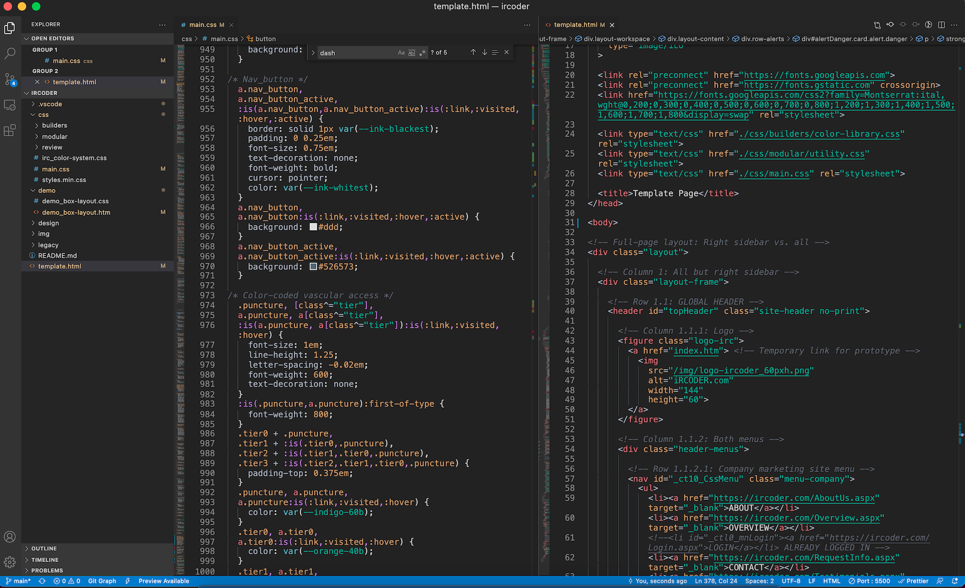
Using the Inspector to test styling. Here, I determine manual widths & heights on an individual element are overriding my CSS.
Published guidelines for when and why each flavor of alert is appropriate keep developers consistent.
Some aging UI components, such as the jQuery-UI datepicker, could be replaced with semantic HTML-native elements for better accessibility and less technical dependency.
Using the Inspector to check the cascade and test styling
Spacing schematic for input groups spaced in multiples of 4 to optimize for em/rem-based CSS
To manage the UI project and offer transparency into our decisions, our development team used the collaborative Atlassian suite including Jira, Confluence, and Bitbucket
Demonstrating updates to interactions in the header menu, including styling, hover states, and transitions
Layouts

I assembled components into predictable, responsive layouts

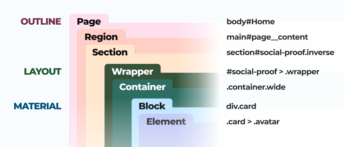
The inconsistency extended beyond individual controls. Pages had been assembled through nested tables, fixed dimensions, inline spacing, and locally invented structures. I established predictable regions for navigation, titles, status information, forms, tables, content, and primary actions. Shared grid, column, alignment, and spacing rules made dense clinical screens easier to scan.

Responsive behavior became part of the layout system. I documented how columns collapsed, actions reflowed, and information retained priority at narrower widths. The goal was not to make every screen identical. It was to make similar information obey the same spatial rules while preserving workflow locations experienced users trusted.

[Gallery lead asset: Full-page before-and-after with structural overlays.]

[Assets: Table-based layout versus revised structure; page anatomy; grid specifications; field alignment; responsive states; developer wireframe.]

[Caption: “Shared page regions and responsive rules allowed complex screens to feel related without forcing every workflow into one template.”]

BEFORE: The original Home screen. Low-value charts consume most of the width. The panel in the far right doesn't fit the screen. Button styles are inconsistent. The user is told "Welcome" or "Hi" three times.
An early grid framework for proposed Home screen widgets
Various sketches of proposed abstract layouts, including tables, column groups, select & field group components, and progressively-enhanced page layouts.
Wireframe sketches of proposed screen regions and how they respond at breakpoint widths for display on various devices. The application had zero responsive strategy prior.
BEFORE: Each subsection uses a separate <table> element for layout, which creates inconsistent alignment between labels and input fields.
BEFORE: A typical screen UI pre-redesign
By presenting ideas as a prototype↗, concepts and hypotheses become tangible and real.
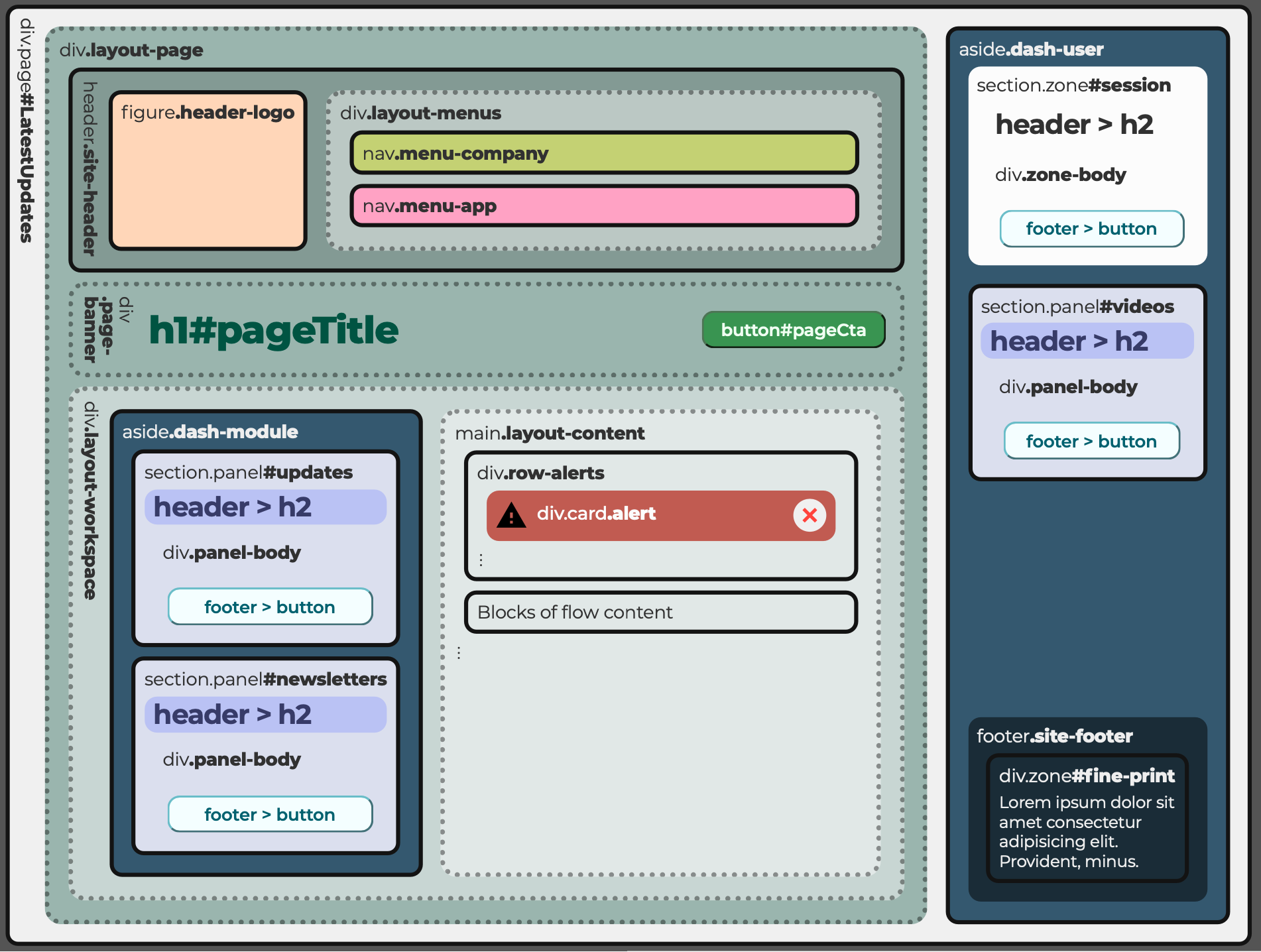
Semantic HTML5 elements for page regions are easier to read and benefit SEO.
Front-End Code

I carried the system from design files into production code

The system needed to exist in the application—not only in Figma—to change delivery. Webflow prototypes made concepts tangible to product leaders and SMEs. HTML sandboxes let developers and QA test behavior. Structural wireframes connected visible regions to box-model and class relationships.

After the process demonstrated value, I gained a dedicated Bitbucket UI branch. I cloned production markup, designed in DevTools, resolved cascade conflicts, and wrote production HTML and CSS for review with the .NET engineers. Implementation exposed exceptions static designs could not predict. Those lessons flowed back into the specifications, making the system more realistic and reducing translation between design intent and production behavior.

[Gallery lead asset: Figma → Webflow → HTML sandbox → DevTools → Bitbucket → production.]

[Assets: Prototype; sandbox; developer wireframe; DevTools diagnosis; commit history; code beside production UI.]

[Caption: “A dedicated UI branch and browser-based workflow turned the design system from a reference library into production infrastructure.”]

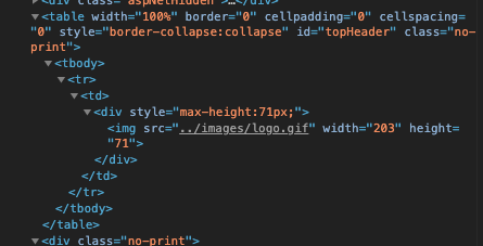
BEFORE: A fixed-size image inside a fixed-height <div> inside a 1x1 table.
A "developer's wireframe" to illustrate box model layout and define classes. GitHub↗ CSS↗.
HTML sandbox prototype of proposed Home screen updates allowed QA and stakeholders to see the collective context of several related changes at once.
To systematically address issues with elements and components one by one, I wrote a specification template in Confluence with an Audit section
This specification would pass through the entire review process in Confluence, including designers, developers, and managers

The application's UI was modernized, enhancing scalability, brand consistency, and user satisfaction.

The design system was published on Confluence, ensuring transparency and accessibility for all stakeholders.

collaboration

⇪ Back to Top | ⇦ Previous | Next ⇨

I delivered the system incrementally through active releases

I prioritized foundations and patterns that could improve multiple screens without requiring an application-wide rewrite. Related changes were grouped into Jira epics and release batches so QA could assess them together. Confluence specifications documented each component’s audit, intended use, states, content guidance, implementation, and approval status. Components were published as they became usable rather than waiting for a theoretical library to be complete.

[Delivery asset: Audit → specification → review → UI branch → QA → publication.]

My branch commit history on Bitbucket

I introduced design standards through the team’s existing workflow

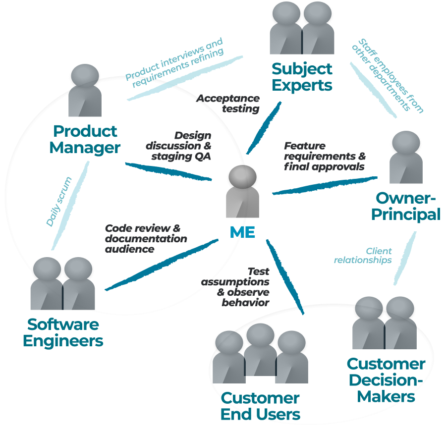
I framed the system around outcomes stakeholders already valued: faster implementation, fewer one-off decisions, easier QA, and lower regression risk. Product leaders and SMEs reviewed workflow implications; engineering reviewed implementation; QA tested release batches. The product manager became an important advocate and testing partner. I owned the audit, system architecture, Figma components, prototypes, front-end code, documentation, and release coordination. Engineering retained backend logic, final merge authority, and production release control.

[Collaboration asset: Product, SME, engineering, QA, and approval relationships.]

Validation

⇪ Back to Top | ⇦ Previous | Next ⇨

I refined each pattern through prototypes, browser implementation, review, and QA.

Webflow and HTML prototypes made behavior reviewable before production. Browser testing exposed cascade, responsiveness, and server-rendering issues. Product and SME review protected workflow continuity, while engineering and QA tested compatibility and regression risk. Production implementation revealed exceptions that needed to become part of the component rules. The project did not include formal task-based usability benchmarking, so its strongest evidence concerns delivery efficiency and system consistency rather than measured user performance.

[Validation asset: Prototype review, technical validation, QA, production learning, and unmeasured outcomes.]

Batching UI updates into releases allowed QA to review the application holistically. Issues were logged in Jira and documented in Confluence.

IMPACT

⇪ Back to Top | ⇦ Previous | Next ⇨

I cut UI delivery time while turning one-off interface work into reusable infrastructure

Comparable UI work moved through delivery 75% faster, while identified UI debt fell 40% over 12 months. I wrote and maintained more than 5,000 lines of production front-end code. Users retained familiar workflows. Developers gained reusable patterns and QA gained a clearer review structure. The system became institutional rather than personal: its standards lived across Figma, code, Jira, and Confluence instead of one contributor’s memory.

[Impact assets: Cycle-time comparison; UI-debt reduction; production contribution; before-and-after screens.]

Josef

Power User
UI improvements did not require downtime nor slow or interfere with established, familiar user experience.

Priya

Clinical Tech
Even with a new look-and-feel, everything was in its familiar place with no difficult renderings or legibility.

Scott

Staff Developer
Delegating front-end code ownership and reusing components from a single source of truth eliminated redundant effort.

REFLECTION

⇪ Back to Top | ⇦ Previous

Incremental delivery turned design-system thinking into working product infrastructure

The project demonstrated that a design system could gain traction in a technically constrained organization by solving immediate delivery problems rather than beginning as a separate design initiative. Building through active releases helped me earn trust, understand the application at implementation depth, and create standards grounded in actual product behavior. The strongest outcome was not visual consistency alone. It was the creation of a shared operating language across design, engineering, product, and QA. Tokens, components, layouts, documentation, and production code became connected parts of the delivery process rather than isolated design artifacts.

I would strengthen the system’s foundations, technical environment, and measurement

  • Begin from first principles. I would establish the system’s rationale, principles, taxonomy, accessibility standards, and governance model before composing improvements feature by feature. The incremental approach was practical, but a clearer conceptual foundation would have made later decisions easier to explain and maintain.
  • Advocate for migration beyond .NET Web Forms. The aging stack constrained semantic markup, responsive behavior, component architecture, front-end tooling, and the degree of implementation ownership design could assume. I would promote a planned move toward a modern, component-based platform before those limitations became an even greater product risk.
  • Connect system adoption to user performance. I would add component-adoption tracking and baseline usability measures for high-frequency workflows. This would show which standards improved clinical work—not only which ones accelerated delivery.
  • Create a versioned implementation library. I would evolve the system toward a testable, independently versioned component package or Storybook environment that could support multiple products without remaining tightly coupled to individual server-rendered pages.