I redesigned a cabin-rental website and booking journey inside LiveRez templates I could not restructure. Through UX strategy, prototyping, custom CSS, and publishing guardrails, I launched a clearer experience in four months.


New owners of a north Georgia luxury cabin-rental business inherited manual booking just as demand surged. They staked the business on going digital-first with LiveRez, a rigid industry-standard platform that exposed only custom CSS and a limited set of content fields. Working solo inside that cage to launch in four months, I rebuilt the listing and booking experience to match the quality of the properties, including information architecture, a token-based color system, and guest-first operational copy.

Problem
New owners inherited great cabins and a booking process from another decade
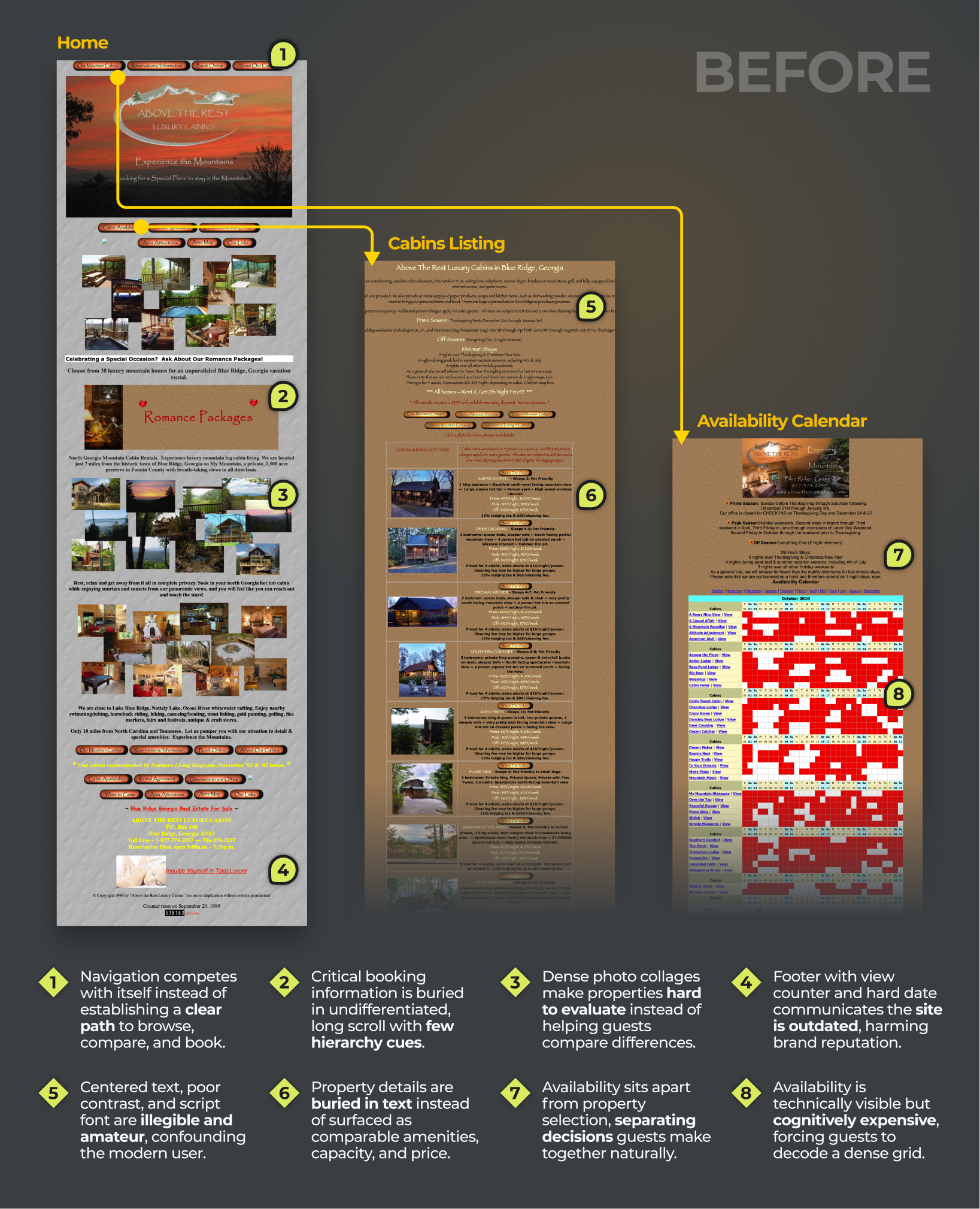
Before the acquisition, guests booked by phoning a reservationist or submitting credit card numbers through a web form and waiting for a reply. The properties photographed like a luxury product; the process behind them ran on trust and manual labor. As COVID drove bookings up and spring approached, the manual model was heading from inefficient to unmanageable right as the new owners staked the business on going digital-first.

The platform that fixed operations locked down the experience
The owners had already committed to LiveRez, the industry-standard rental platform many competitors also used with a unique skin on nearly identical templates. It solved reservations and payments but exposed exactly two levers for the experience: custom CSS over rigid, outdated Bootstrap templates, and a limited set of content fields. Every improvement to trust, clarity, and brand had to be achieved inside that cage, on a timeline measured in months.

insight
I went onsite to learn where guests hesitated
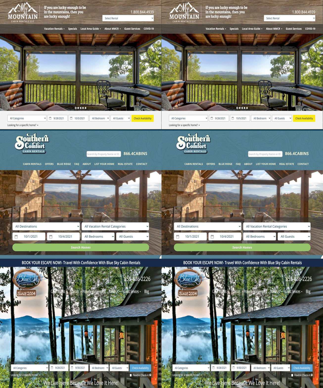
I spent two nights at a property while helping staff migrate data into LiveRez, interviewed stakeholders, and combined those observations with years of historical analytics. Onsite work exposed operational details analytics couldn't, including unreliable mountain GPS. The data also showed unusually high early bounce among younger visitors. Competitor review helped separate platform limitations from problems I could actually influence.
Booking confidence came from clarity, not decoration
Guests were choosing among genuinely high-quality properties, so ambiguity in navigation, listings, logistics, or next steps could erode confidence faster than visual polish restored it. Inside a platform I couldn't restructure, the highest-leverage work was making the controllable path easier to understand.
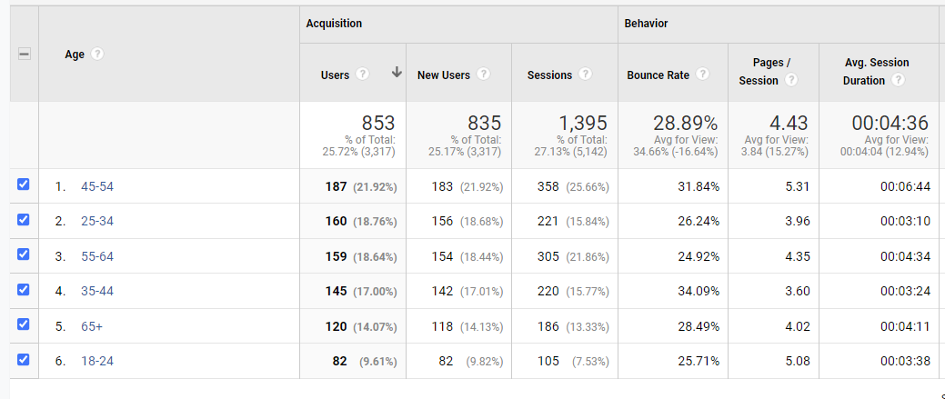
Jobs to be done: When guests plan an important trip, they need to understand property differences, price, availability, logistics, and the booking process quickly enough to commit confidently.

Jan

Jordan

Steve
decision
Restyle it, optimize it, or redesign the whole experience?
Research showed that presentation and usability were hurting digital-first guests, but LiveRez controlled the templates, reservation logic, and much of the page structure. I considered three approaches:
- Restyle the existing templates — Apply the brand and minor CSS improvements while leaving hierarchy and content patterns mostly intact.
- Improve property content — Focus on photography, descriptions, metadata, and SEO without substantially changing the interface.
- Redesign every controllable layer — Define the visual and verbal brand, reprioritize information, prototype the ideal experience, translate it into reusable UI patterns, and govern owner-managed publishing.
Design tension: The booking experience had to earn the trust the properties deserved, inside a platform that couldn't be restructured and on a timeline the season demanded.
I treated the platform as a fixed boundary and redesigned everything inside it
Half-measures would leave the trust gap in place, and the whole point was making the booking experience vouch for the properties. The third option offered the greatest improvement without pretending I could change architecture LiveRez did not expose. I treated brand, voice, information architecture, interface design, and front-end presentation as one controllable system, while preserving useful platform and human channels such as real-time availability and phone booking.

Gallery
I turned a new identity into a flexible visual system
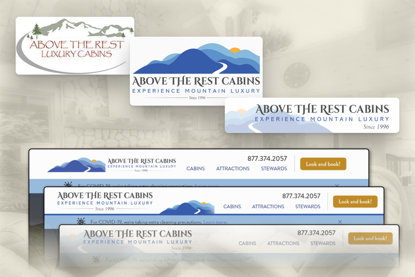
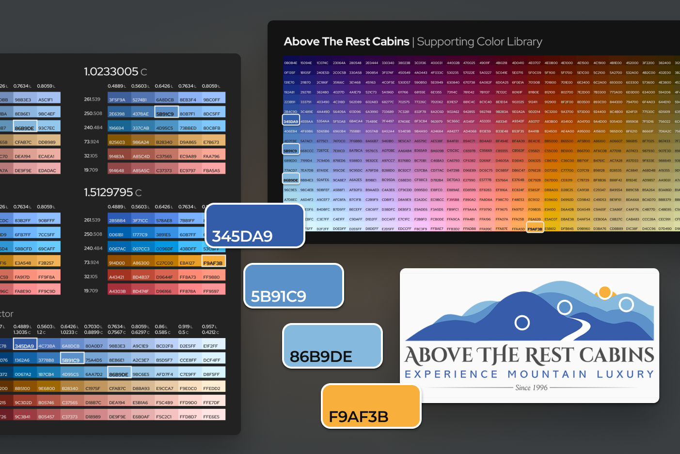
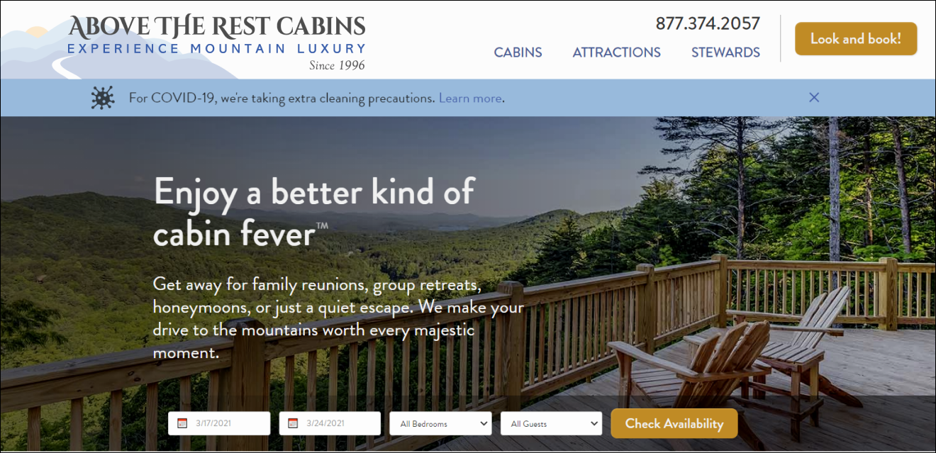
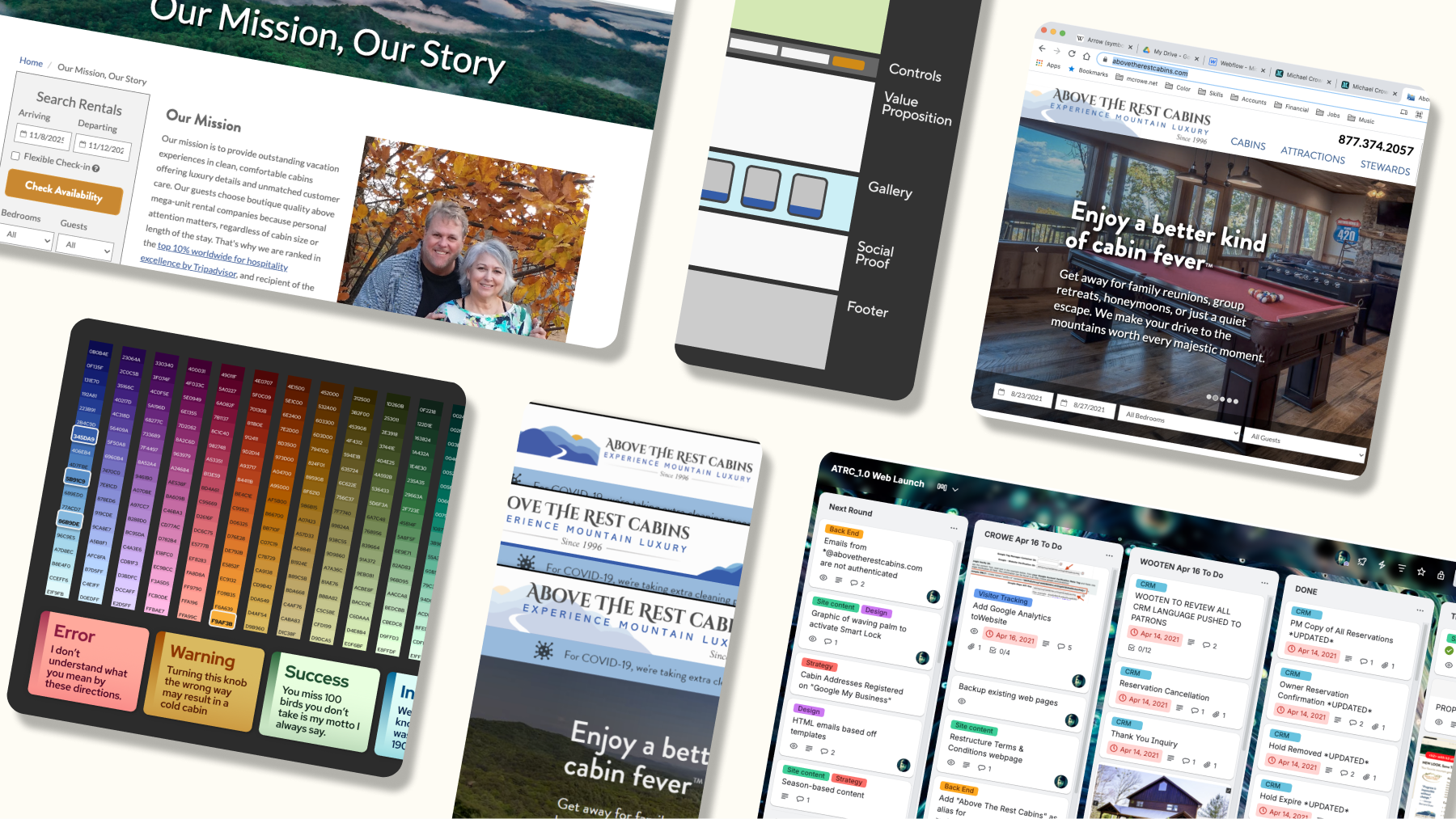
The owners inherited cabins that photographed like a luxury product and an identity that read like a 2009 template. Their replacement logo baked "Since 1996" into a rigid square crest that fought every screen it met. I broke the logo into a modular system the client could see working in a live prototype, graded the brand colors into a unified okLab palette, and systematized type, color, and photographic treatment so the online presence finally vouched for the physical product. That system gave the brand enough flexibility to feel consistent across pages and devices.
I reframed the brand voice from authority to informed hospitality
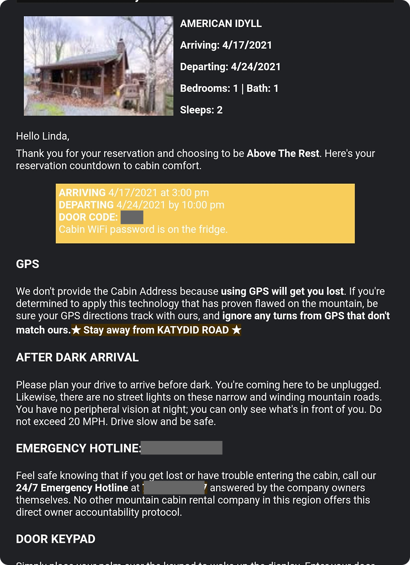
I user-tested the existing copy's tone with longtime local residents, whose feedback moved the voice from dismissive toward collaborative language. I then wrote the operational copy guests actually depend on:
- Per-cabin driving directions that override unreliable mountain GPS
- Arrival and door-keypad instructions
- After-dark guidance
The goal was to sound distinctly North Georgia without slipping into generic “rustic cabin” clichés or promotional language that obscured useful information. Content rules protected all of it from well-meaning WYSIWYG edits, keeping headings semantic, formatting restrained, and the page outline intact for accessibility and SEO.

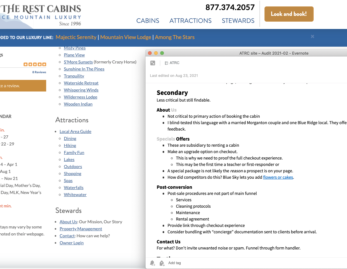
I redesigned the controllable journey around how guests actually choose and book
Analytics, Lighthouse benchmarking, and time onsite with staff showed that booking confidence eroded at small points of ambiguity, not aesthetics:
- I mapped how families and solo travelers searched, compared, and committed.
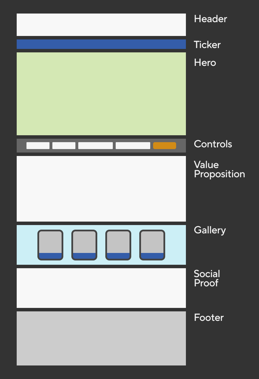
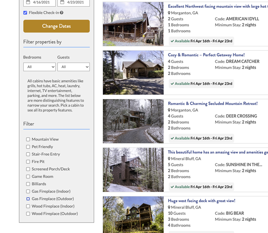
- I restructured listings, filters, and navigation around the paths guests actually took.
- I validated it all through a Webflow prototype that doubled as the project's running changelog and review surface.
I translated the design system into production within LiveRez’s constraints
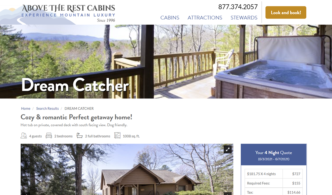
LiveRez exposed custom CSS and a handful of content fields over rigid, outdated Bootstrap templates. I hand-authored a CSS layer with token-based brand colors and micro-interactions that made the stock platform behave like a custom build, and packaged the Webflow prototype so the vendor could integrate it directly into their template development. I also created formatting rules so owner-managed WYSIWYG content could remain flexible without allowing manual styling to undermine the hierarchy of the interface.



Delivery
I delivered through project tools and browser-based prototype
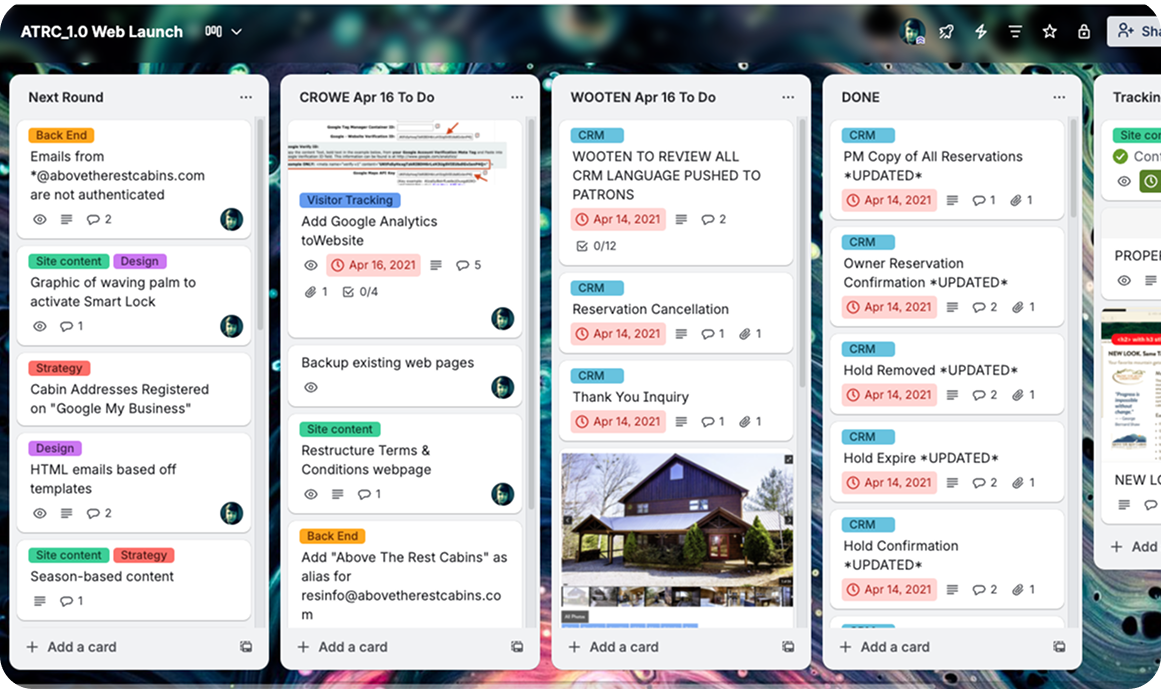
Trello gave the project a shared progress view while the Webflow prototype preserved the approved design direction and could integrate directly into development. Around the booking flow, I wrote guest-facing copy, including driving directions, arrival instructions, and pages for special offers and packages. The owners retained business-content approval. LiveRez controlled the underlying templates and reservation logic. The site launched four months into the engagement.
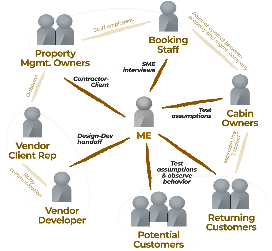
I kept a hands-on client and a locked vendor from stalling each other
The client, mid-acquisition and juggling operations, tended to pull work into revision churn. By enforcing a single source-of-truth serving all sides, I held the project shippable with firm review boundaries and real-time documentation of brand, pattern, copy, and code decisions. Where client WYSIWYG edits might imperil this careful structure, content rules protected the page outline, accessibility, and SEO from liability after handoff.
Validation
The system survived after I left
I benchmarked the platform with Lighthouse, tested brand voice with local residents, and reviewed interactions through the Webflow prototype with client and vendor. The strongest evidence is durability: the LiveRez implementation remained in production for five years while the client managed content independently and the underlying CSS and content rules held.
IMPACT
I launched before peak season with a maintainable digital booking experience
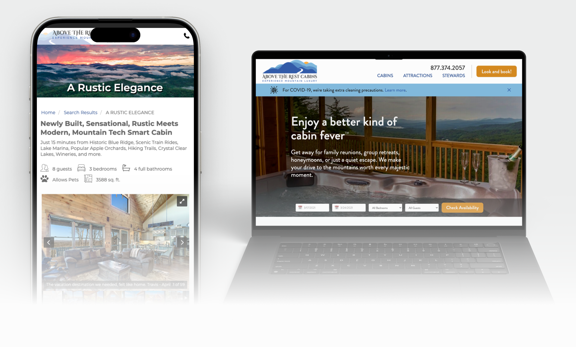
Guests gained clearer property comparison, real-time availability, stronger logistics information, and a more direct booking path. The owners gained a coherent visual and verbal brand, reusable content and interface patterns, and a maintainable digital operating model despite the constraints of a shared vendor platform.

Jan
Jordan
Steve
REFLECTION
A locked platform required systems thinking beyond the interface
Meaningful improvement was possible without control of the booking architecture because brand, voice, information architecture, interface rules, front-end code, and publishing governance were still powerful levers. The project demonstrated that constraint-led design is not about accepting the default experience; it is about identifying precisely where design authority still exists and using those layers as one coordinated system.
What I'd do differently next time...
I would preserve owner control over business content while drawing firmer boundaries around presentation, scope, measurement, and the limits of the platform itself.
- Separate content from formatting authority.
- Enforce firmer scope and acceptance rules.
- Instrument the complete booking funnel.
- Define triggers for platform migration.
The next version would keep the same pragmatic constraint-led design approach while giving the system stronger protection against both editorial drift and platform ceilings.