Tokens, components, and Webflow build notes for the portfolio: the home page and the case study template. Every specimen on this page is rendered with the real component classes, so what you see here is what the site uses.
Version 0.3, November 2026Source home and case study prototypesTarget Webflow, Client-First namingModes Light, Dark, Auto
Naming conventions
Class names follow Finsweet’s Client-First conventions because they map cleanly to how Webflow handles base classes and combo classes. The Atomic Design level is tracked in this document, not in the class name.
Pattern
Example
Meaning
Component root
case-card_component
The outer element of a reusable block. One underscore separates the component name from the element.
Component element
case-card_title
A child of that component. Never more than one underscore.
Combo class
is-hidden
A variant stacked on a base class: button is-secondary.
Utility class
text-size-large
Single-purpose styling. No underscore.
Atom base class
button
Small reusable atoms get a plain name with no underscore.
Variable
--ink-soft
Prototype CSS name. In Webflow it lives at Theme: Color/ink-soft and publishes as --_theme---color--ink-soft. The System / Styles embed aliases the short names, so both work.
Docs-only
is-hover, ds-*
Static state classes and ds- classes exist only on this page. Its subheadings use the Webflow classes ds-h3 and ds-h4, whose margins come from Space variables. For states, use Webflow’s Hover, Pressed and Focused states instead.
Webflow can’t style ::before or ::after in the Designer. The prototype used pseudo-elements for a few decorative details. This system replaces each one with a real element, such as case-card_marker, case-card_scrim, theme-switch_thumb and timeline_dot, so all of it can be built without custom CSS.
Principles
Recruiters first
Every component answers a hiring question fast: who, what level, what proof, how to reach you. Decoration never pushes facts below the fold.
One accent per story
Each case owns one accent color, carried from its case page. Accents mark identity. They don’t signal state or importance.
Quiet chrome, bold art
The interface stays neutral so the cel-shaded illustrations and the project diagrams can carry the personality.
Honest by default
Result blocks state what was measured. Draft and in-progress work is labeled as such, never dressed up.
Color
Semantic tokens with a Light and a Dark value. Values are authored in OKLCH. The sRGB hex next to each value is a fallback you can use anywhere OKLCH isn’t accepted. Webflow variables hold the hex values. Click any code chip to copy it.
WCAG 2.x ratios, calculated from the hex values above.
Pair
Tokens
Light
Dark
Body text
--ink on --paper
15.2:1 AAA
16.5:1 AAA
Body text on cards
--ink on --surface
15.7:1 AAA
15.4:1 AAA
Secondary text
--ink-soft on --paper
6.8:1 AA
8.6:1 AAA
Secondary text on wells
--ink-soft on --well
6.1:1 AA
7.2:1 AAA
Links
--brand-ink on --paper
6.2:1 AA
10.5:1 AAA
Primary button label
--paper on --ink
15.2:1 AAA
16.5:1 AAA
Accent from one hue
Each case study is colored by a single number: a hue angle. Every accent role is derived from it with fixed lightness and chroma, so a new case only needs a hue to look right in both themes, and its text contrast is guaranteed before anyone picks the color.
--accent
--accent-hi
--accent-ink
--accent-soft
--accent-line
75%
faster UI delivery
2Insight
Jobs to be done: When clinical staff complete high-frequency workflows, they need consistent behavior.
Try the prototypeHoverDesign systems
Roles
Token
Light
Dark
Use
--hue
Projects › Color › Hue°
Same as light
The only input. A number from 0 to 360, set on the page wrapper by the template embed.
--accent
oklch(0.57 0.195 var(--hue))
Same as light
Fills and lines: marker, art underline, contents bar, progress, quote bar
Tinted surfaces: chapter numbers, quote, outcome personas
--accent-line
oklch(0.83 0.07 var(--hue))
oklch(0.43 0.09 var(--hue))
Accent borders and rings
--accent-glow
oklch(0.57 0.195 var(--hue) / 0.55)
oklch(0.5 0.17 var(--hue) / 0.45)
Colored shadow under the hero art
--tone-hi
oklch(0.9 0.12 var(--hue))
oklch(0.8 0.13 var(--hue))
Illustration: whites, top left of the gradient
--tone-mid
oklch(0.62 0.17 var(--hue))
oklch(0.52 0.15 var(--hue))
Illustration: whites, bottom right of the gradient
--tone-deep
oklch(0.2 0.06 var(--hue))
oklch(0.15 0.045 var(--hue))
Illustration: blacks
--tone-sheen
oklch(0.97 0.09 var(--hue) / 0.6)
oklch(0.9 0.1 var(--hue) / 0.45)
Illustration: the light band that crosses on hover
Contrast at every hue
Checked at 1° steps from 0 to 359, after the browser clips each color to sRGB. These are the lowest ratios found anywhere on the wheel.
Pair
Light
Dark
Needs
--accent-ink on --surface
5.99lowest, at hue 191°
10.32lowest, at hue 19°
4.5
--accent-ink on --accent-soft
5.52lowest, at hue 192°
9.37lowest, at hue 20°
4.5
--paper on --accent-ink(accent button, hover)
5.77lowest, at hue 191°
11.03lowest, at hue 19°
4.5
--ink on --accent-soft(body text in a quote)
14.19lowest, at hue 17°
13.62lowest, at hue 175°
4.5
Why one field is enough
Each Project points to a Semantic colors item that stores a Hue° plus 14 hand-set colors. Regenerating the accent from the Hue° alone lands on the stored values. The small gaps are where the original tool clipped out-of-gamut colors.
Case
Hue°
Stored accent → from hue
Stored highlight → from hue
iRCODER
213-Azure
212.9°
#008EBA → #008FBA
ΔE 0.3
#00ECFF → #00E8FF
ΔE 1.1
DaySheet
327-Magenta
327.3°
#AF40B0 → #B041B1
ΔE 0.3
#FFABFF → #FFA6FF
ΔE 1.2
IMA
028-Scarlet
28.75°
#D1361C → #D2352A
ΔE 1.1
#FFA88F → #FFA290
ΔE 1.5
MAMI
283-Violet
283.67°
#6D5DE5 → #6E5EE4
ΔE 0.3
#C5C3FF → #C1BEFF
ΔE 1.5
ATRC
084-Amber
84.5°
#AA6600 → #AB6700
ΔE 0.3
#FFC844 → #FEC436
ΔE 1.1
NueMD
144-Green
144°
#009100 → #00920E
ΔE 0.4
#8EED8E → #88E988
ΔE 1.4
In Webflow, with no CMS changes. The Projects template already references Semantic colors. A hidden text element with the u-data-holder class is bound to Color › Hue°, and a one-line script copies it into --hue on the page wrapper. (Webflow can’t bind a field into an embed’s CSS or a div attribute.) The 14 color fields stop being read. Later, a plain Number field named Hue on Projects can replace the reference. That swaps one field for another, so it fits under the 60-field limit. Home cards could then read it through their Project reference, and their two hex fields could go.
Home cards today still use the two stored hex values with OKLab mixing: color-mix(in oklab, var(--accent) 74%, black). Both methods give close results, so cases can move to the hue model one at a time.
Typography
One family: TT Norms Pro, the licensed font already installed on the Webflow site, bound to the Font: Family/sans variable. Body text is 18px (step-0), up from 17px, with slightly tighter leading: 1.5 for interface copy and 1.62 for long-form case study prose. Larger steps keep their 1.25 rhythm and the two largest are fluid. Every size and line height comes from a token, so a change here reaches every component.
Token
Specimen
Size / line / weight / tracking
Value
Webflow class
Use
--step-4
Build it
40–72px
1.03 / 700 / -0.035em
clamp(2.5rem, 1.6rem + 3.8vw, 4.5rem)
heading-style-display
Hero headline, contact headline
--step-3
Easier to build
28–38px
1.12 / 700 / -0.02em
clamp(1.75rem, 1.4rem + 1.4vw, 2.375rem)
heading-style-h2
Section titles
--step-2
Easier to build
25px
1.12 / 700 / -0.02em
1.5625rem
heading-style-h3
Case card titles
--step-1
Easier to build
21px
1.42 (leading-lede) / 500–700 / -0.015em
1.3125rem
text-size-large
Lede paragraphs, principle titles
--step-0
Easier to build
18px
1.5 (leading-body); 1.62 in long-form rich text (leading-prose) / 400 / 0
small text: fact values, methodology, legend notes
--leading-caption
1.3 (Webflow: Size: Leading/caption)
Rich Text captions and the paragraph after a video, so they read apart from body text
--measure
62ch
Maximum line length for body copy
Spacing and layout
An 8px grid with a 4px half-step. Section padding uses the two largest steps.
Token
rem
px
--space-1
0.25rem
4px
--space-2
0.5rem
8px
--space-3
0.75rem
12px
--space-4
1rem
16px
--space-5
1.5rem
24px
--space-6
2rem
32px
--space-7
3rem
48px
--space-8
4.5rem
72px
--space-9
7rem
112px
Layout and breakpoints
Prototype
Webflow
What changes
Above 980px
Desktop (base)
Hero is two columns. Case cards in a 2-column grid.
980px and below
Tablet, 991px
Hero and About stack.
760px and below
Mobile landscape, 767px
Cards go to one column. Fact rows stack label above value. The secondary row scrolls sideways.
600px and below
System / Header embed
The brand name hides; the mark stays. It never wraps to two lines.
460px and below
Mobile portrait, 478px
The Inspect label hides. Glance buttons stack.
Token or class
Value
Use
container-large
max-width 1180px (--page)
Page content width
padding-global
1.25rem left and right
Side gutters at every size
padding-section-large
--space-9, --space-8 on mobile
Vertical section padding
Radius
Radius grows with the size of the element. A card never shares a radius with the button inside it.
Token
Value
Use
--radius-sm
8px
Nav links, tags inside panels
--radius-button
11px
Buttons, inspect toggle
--radius-md
12px
Fact blocks, toolkit, toast, legend
--radius-lg
22px
Cards, glance panel, principles
--radius-pill
999px
Chips, tags, theme switch, status pill
Elevation and gradients
Three shadow levels tinted with the ink color, plus a one-pixel top highlight (--hl) on raised surfaces. In dark mode, shadows switch to black and the highlight drops to 7% white.
--shadow-1
--shadow-2
--shadow-3
1 chips, buttons, tiles2 case cards at rest3 glance panel, hovered cards, toasts
--surface-grad
button fill
glance gradient border
contact surface (always dark)
Gradients stay subtle and directional. Use them on surfaces, never behind body text in the middle of a section.
Motion
One shared easing curve. Motion responds to the visitor. The only unprompted motion is the hero’s load-in, played once.
Token
Value
Use
--ease-out
cubic-bezier(0.22, 1, 0.36, 1)
Everything that moves
--dur-fast
200ms
Button, chip and link color and lift
--dur-base
350ms
Theme switch thumb and hover shadow
--dur-slow
600ms
Case inset straightens and lifts on card hover
--dur-ambient
1200ms
Illustration zooms to 105% and the sheen crosses on card hover
Hero reveal
700ms fade, 900ms rise, 90ms stagger
Page load only
Reduced motion: when the visitor asks for less motion, transitions are removed, the illustration doesn’t zoom, the sheen doesn’t move, the inset doesn’t tilt, and the hero appears without the reveal.
Icons and illustration
Icons
sun
moon
inspect
download
16px in controls, 18px in buttons1.5 to 1.7 stroke, round capsColor is currentColor
Case illustrations
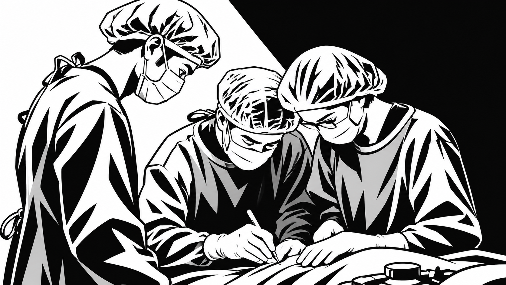
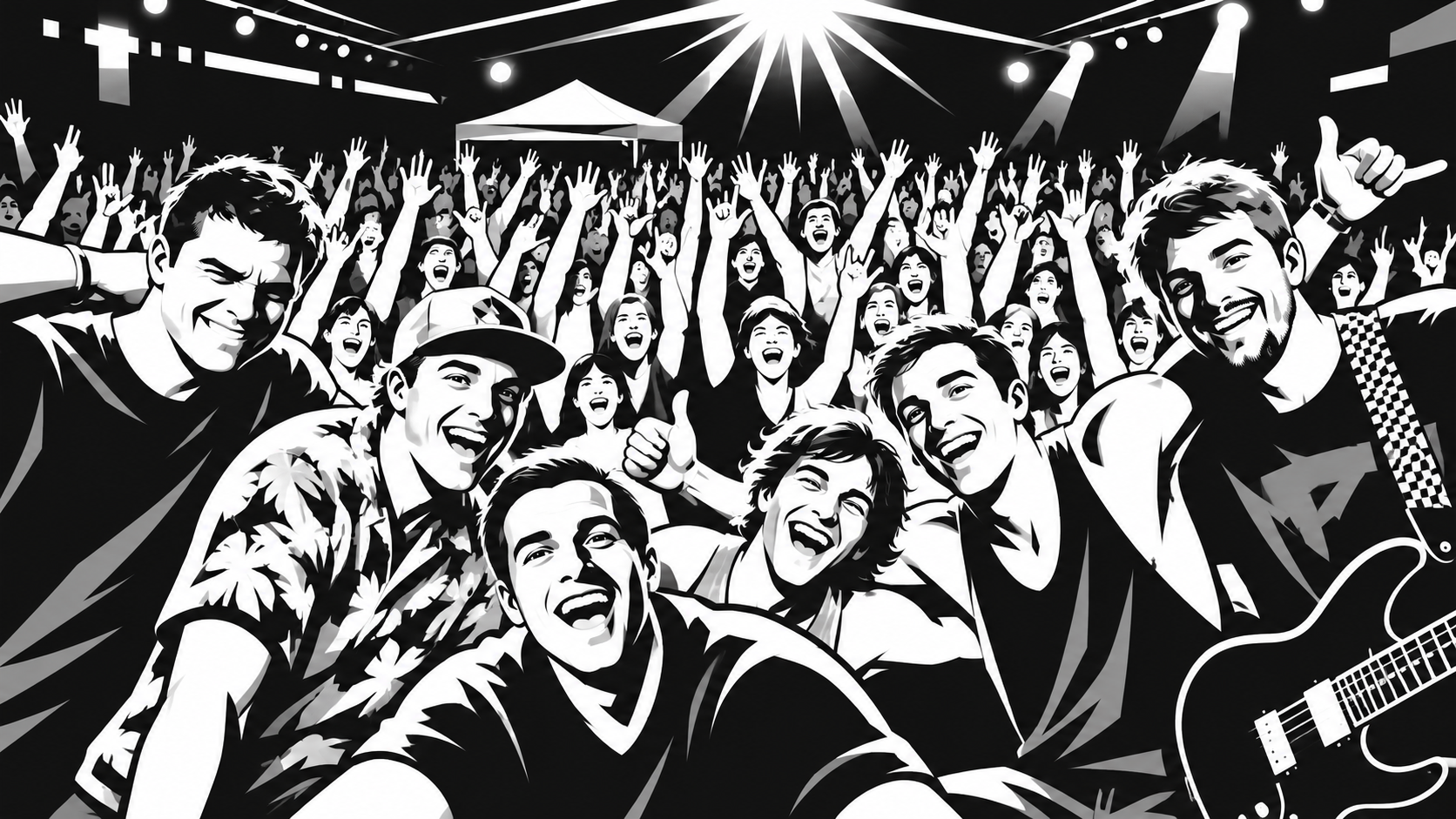
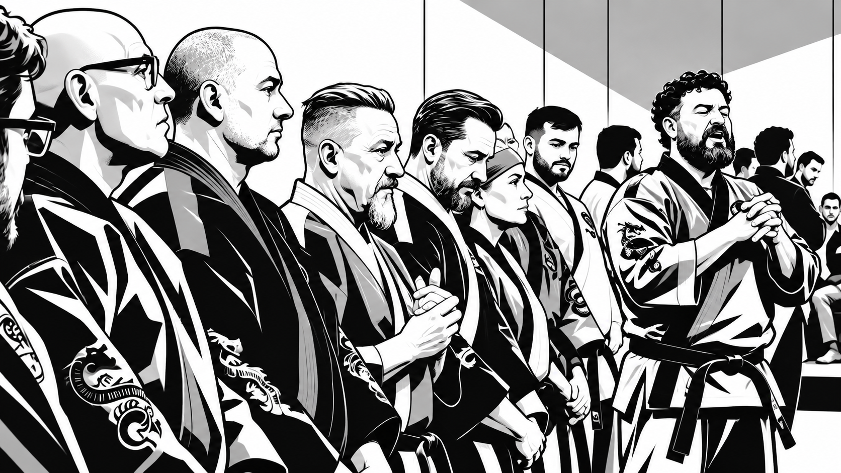
Each case uses its Project’s Thumbnail Pic: a monochrome, high-contrast cel-shaded illustration. The page recolors it from the case hue, so the art always matches the accent and needs no second version for dark mode.
iRCODERcel_irc-ui.webp, hue 212.9°
DaySheetcel_daysheet-ux.webp, hue 327.3°
IMAcel_ima-digital.webp, hue 28.75°
MAMIcel_mami-web.webp, hue 283.67°
ATRCcel_atrc-web.webp, hue 84.5°
NueMDcel_onboarding-ux.webp, hue 144°
Layers case-card_broll (img), case-card_tone, case-card_shade, case-card_sheen, case-card_scrimHover a card to see the sheen cross.
A soft light band; slides across on hover, once on page load in the hero
case-card_scrim
linear-gradient(to top left, oklch(0.16 0.03 255 / 0.5), transparent 55%)
Normal
Darkens the bottom right so the inset stands out
Rules for new illustrations
Source: monochrome, high-contrast cel shading in black, white, and one or two grays. 16:9, at least 1600px wide (the current set is 1672 × 941).
Composition: keep faces and the main subject out of the bottom-right third. The inset sits there, and the hero crops to 4:3 on desktop.
Color: none in the file. The hue layers add it, so the same image works in light and dark themes and if the case hue changes.
Home cards today: they don’t have a hue yet, so the System / Styles embed mixes the same four tones from each card’s two stored hex accents. For example, the deep shade is 30% of the accent mixed with black in OKLab. The result lands within a few percent of the hue model.
Webflow: bind an Image element to Thumbnail Pic (on Home, through the card’s Project reference). Add three empty divs and set their blend mode in the Effects panel. The hover sheen goes in the System / Styles embed, because the Designer can’t style a child on its parent’s hover.
Atoms
The smallest pieces. Each one does one job and has no layout opinion about where it’s placed.
User experienceProcess & procedureDesign SystemsUser interface designProduct management
Elements tag_icon (img)A Collection List sourced from the Project’s Topics multi-reference, in the order set in the CMS. Each pill binds Full-Name and Icon Black. In dark mode the black icons are inverted.
Badge .badge
Newbadge
Draftbadge is-draft
Use “New” for the newest case study only, and “Draft” for case studies still being written.
Status pill .status-pill
Open to senior product design and design systems roles
Small groups of atoms that work as one control or one block of content.
Theme switch .theme-switch_component
Light
Dark
Elements theme-switch_thumb, theme-switch_button ×2 (Light, Dark)Default follows the system setting until the visitor picks one. Picking the theme the system already uses clears the saved choice, so the page goes back to following the system.State is-active on the button for the theme in use; the thumb moves with u-theme-dark, set before paint.
Inspect toggle .inspect-toggle
None
Hover
is-active
Fact list .fact-list
Focus
Design systems, enterprise UX, design-to-code
Location
Atlanta, GA. Open to remote and hybrid.
fact-list (glance panel)
My role
Technical writing manager
Result
Onboarding went from about four weeks to two.
fact-list is-accent, row is-result
Elements fact-list_row, fact-list_label (dt), fact-list_value (dd)Rows stack below 767px
Hiring filter .lens_component
Filter by what you’re hiring for
Elements lens_label, lens_chips, lens_resultTry it: the result line updates as the homepage does.
Principle card .principle_card
I look for the problem behind the request
Teams usually ask for a fix to the part that hurts. I trace it back to the part that’s causing it.
The martial arts school asked for more leads. The leads were fine. The handoffs after them weren’t.
Elements principle_title, principle_text, principle_proofEvery principle needs a proof line drawn from a real case.
Timeline item .timeline_item
Product designer and UI developerMedical Asset Management
Google UX Design CertificateResearch and usability testing
Elements timeline_track, timeline_year, timeline_dot, timeline_textState is-current on the latest entry
Toast .toast
Email address copied
Fixed to the bottom center, visible for 2.4 seconds, announced with role='status'. The message names what just happened.
Case insets .case-card_inset
Each case card floats a small diagram of its project over the illustration. The inset sizes itself to the card (2.1% of the art width per em), so all six scale together.
Procedure savedCharges post after review. You can still edit codes.
inset-system_board
Search and social
Form captures program and location
Book a trial class
Eight-week follow-up runs itself
Front desk welcome
First class
inset-journey_list
Fall tour8 dates
14AshevilleLoad-in 4:00 pmConfirmed
15KnoxvilleLodging missingNeeds info
16Off dayHotel bookedReady
inset-phone_component
WordPress, 2017
Webflow, 2019
In-house, 2021
inset-sites_stack
Steps to book, before
After the redesign
inset-steps_board
New practice training3 of 4 lessons
✓Scheduling basics
✓Patient intake
✓Billing and claims
✓Reports
Support access unlocks when training is complete
inset-lms_board
Combo is-panel adds the surface, border and shadow. The phone and the stacked windows bring their own.
Metric card .metric_cardIn Webflow
75%
faster UI delivery
How I measured this
Median cycle time for a UI Jira ticket moving from In Progress to Done, comparing the year full-stack developers handled UI to the year I handled it.
40%
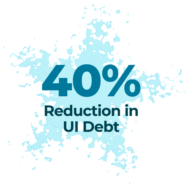
reduction in UI debt
How I measured this
Redundant component variants and one-off CSS overrides replaced, measured by source-code diff over a 12-month interval.
Elements metric_value, metric_label, metric_method (details)Projects › Outcome 1 and 2: Huge numeric, Stated metric, Methodology. The disclosure is left out when Methodology is empty.
Persona card .persona_cardIn Webflow
Priya
Clinical Tech
Daily user entering procedure data, relying on clarity, consistency, and speed under time pressure.
persona_card: Problem short (Insight)
Priya
Clinical Tech
Even with a new look-and-feel, everything was in its familiar place with no difficult renderings or legibility.
persona_card is-outcome: Outcome short (Impact)
Elements persona_header, persona_portrait, persona_avatar, persona_check, persona_name, persona_role, persona_textTwo Collection Lists of Personas, sorted by Sort: after Insight (“Who I designed for”, Problem short) and after Impact (“What changed for them”, Outcome short). Each card carries its Case Study Project slug in a hidden u-data-holder; the template script keeps only this Project’s personas and hides the block when none match. The is-outcome check is always green (Fixed: Color/live at 80% with black), never the case hue, so it reads as success.
Chapter header and rich text .case-proseIn Webflow
2
Insight
Why did routine interface work require so much engineering effort?
I audited the implemented product rather than starting with a speculative redesign, revealing over a decade of local decisions with no shared foundation.
Jobs to be done: When clinical staff complete high-frequency workflows, they need consistent behavior so they can work without relearning each screen.
Lists take the accent as their marker
Figures and videos span the full column
Captions sit left, inset under the asset, with a ▲ in the case hue pointing up at it and tighter leading than body text.
Elements case-chapter_header, case-chapter_number, case-chapter_label (h2)The h2 label is set in --step-3, uppercase with −0.015em tracking and --ink, so it outranks the step-2 h3s inside the prose. The number is a filled --accent-soft tile with no stroke. Blockquotes carry one 6px --accent bar (the Webflow default gray border is removed) and match the Overview text: --step-1 on --leading-lede. Add case-prose to each Rich Text element. Text keeps a 66ch measure; figures and videos run the full column. Captions: figcaption, or the paragraph right after a video, set in --small with --leading-caption and a hanging ▲ in --accent.
acase-card_art-linkadded by script; same URL as the title
divcase-card_body
divcase-card_meta
badgeoptional
case-card_client > case-card_marker
h3case-card_title > a
pcase-card_problem
dlfact-listis-accent
divcase-card_tags > tag
divcase-card_links
buttonis-accent
text-linkis-accent
case-card_read-time
Variant or state
Class
Behavior
Standard
case-card_component
Art on top (300px), body below. Fills one column of the 2-column grid. Every card uses this layout; the first card in the order gets the emphasis.
Art link
case-card_art-link
The whole illustration area opens the case study. System / Script adds the link with the title link’s URL; it is hidden from screen readers and skipped by Tab, because the title link already covers it.
Hover
Hover state
Border takes the accent, shadow rises to level 3 with an accent glow, the illustration zooms to 105%, the sheen crosses, and the inset straightens.
Filtered out
work_item is-hidden
Removed from the grid (display: none) so the remaining cards close up. The change animates as a view transition where the browser supports it, and is instant with reduced motion.
Glance panel .glance_component
Elements glance_header, glance_name, glance_title, glance_actionsGradient border is two backgrounds: surface on padding-box, gradient on border-box.
Site header .nav_componentWebflow component: System / Header
Elements nav_container, nav_brand, nav_brand-mark, nav_brand-name, nav_actionsOne global row on every page: brand (links Home) and actions only. Section and chapter links sit in the secondary row, subnav_component, documented under Organisms. The mark is never put in a circle or rounded mask.
Contact section .section_contact
Hiring for a senior product designer?
I’m looking for a team where design systems, product thinking, and front-end craft all count.
Always dark in both themes. Buttons inside it switch to light fills automatically.
Footer .footer_componentIn Webflow
Webflow component System / FooterElements footer_row, footer_linkGlobal: Home, the case study template and this page. Back to top scrolls to the top even on pages without a #top target.
Secondary row .subnav_componentIn Webflow
Home: page sections (brand accent)
Case study: chapters, case accent and reading progress
Elements subnav_container, subnav_list, subnav_item, subnav_link (is-current), subnav_num, subnav_progress, subnav_progress-barSticky at 68px, directly under System / Header, at every width. Page-local links only; the global row never changes. The header removes its own bottom rule when a subnav follows. Scroll-spy and reading progress live in the System / Header embed; progress shows only when the page marks an element with data-read-target. The row holds links only, with no label, so the chapters get the full width on mobile. Clicking a link jumps there with one fast native scroll.
Case hero .case-hero_componentIn Webflow
iRCoder/2021–2024
Build and ship a design system for legacy B2B SaaS
I designed, coded, and documented the first design system in this medical SaaS product’s 15-year history. I replaced fragmented UI decisions with reusable foundations, components, layouts, and production code that accelerated delivery.
Procedure savedCharges post after review. You can still edit codes.
Elements case-hero_grid, case-hero_text, case-hero_meta, case-hero_title (h1), case-hero_lede, case-hero_actions, case-hero_art, case-hero_noteThe art reuses the Home card’s illustration and inset, so the card visibly opens into the page.
Case summary .case-summary_componentIn Webflow
My role
Role
Product Designer / UI Developer
Company
Medical Asset Management
Where
Atlanta, GA
Timeline
2021–2024
75%
faster UI delivery
How I measured this
Median cycle time for a UI Jira ticket moving from In Progress to Done, comparing the year full-stack developers handled UI to the year I handled it.
40%
reduction in UI debt
How I measured this
Redundant component variants and one-off CSS overrides replaced, measured by source-code diff over a 12-month interval.
What sets this work apart
The rare combination on display — I did the design, wrote the production front-end code, and drove the system as a product owner would, not just as a screen designer.
Skills in this case
User experienceProcess & procedureDesign SystemsUser interface designProduct managementColor science
Elements case-summary_grid, case-summary_cell (is-role), case-summary_label, case-summary_foot, case-summary_note, case-summary_topicsUses fact-list, metric_card and tag is-icon. My role is a Collection List sourced from the Which job? multi-reference (first Position): Job Title, then Employer or Client › Name and City & State. Timeline reads the years from Date Start and Date End (no end date reads “present”). Skills is a Collection List sourced from Topics. Wide: role, then two metric columns; footer side by side. Under 992px the role cell spans the full width, the metrics sit side by side and the footer stacks. Under 768px everything stacks.
Artifact .artifact_componentIn Webflow
Brand
I turned scattered values and language into a shared product vocabulary
By defining tokens to enforce fundamental design discipline, I collapsed years of scattered color, type, spacing, icons, states, and interface copy into shared rules. Five typefaces became one brand family plus a monospace, while reusable tokens governed visual decisions. I applied the same approach to language, standardizing action labels and rewriting messages around what happened and what users should do next.
Testing contrast across hues live in the browser. Every color is perceptually uniform in okLab.
Elements artifact_header, artifact_title (h3), case-proseNo card around it: the galleries follow each other in Build, 72px apart (--space-8), so text and images keep the full column. One per filled gallery slot, 4a to 4d.
Outcome figures .case-outcomesIn Webflow
75%faster UI delivery
Median cycle time for a UI Jira ticket moving from In Progress to Done, comparing the year full-stack developers handled UI to the year I handled it.
40%reduction in UI debt
Redundant component variants and one-off CSS overrides replaced, measured by source-code diff over a 12-month interval.
Elements case-outcome (figure), case-outcome_img, case-outcome_caption, case-outcome_value, case-outcome_methodBetween Impact and Reflection. Outcome 1 and 2: Graphic, with the accent title built from Huge numeric + Stated metric and the Methodology below. A card without a graphic is hidden. The same spot is where “What changed for them” follows. Figures around them: case-figure is-inset (Relationships Pic, after Delivery) and case-figure is-full (Screens Pic, after Validation).
Elements case-pager_head, case-pager_grid, case-pager_kickerReuses case-card_component. Static for now: two curated Collection Lists of Projects, one item each (DaySheet next, wide; NueMD previous). The cards bind Thumbnail Pic; kicker, meta, title and read time are typed in. System / Script hydrates them like Home cards (data-card, data-scene, data-layout='Wide', data-accent), which adds is-wide, the inset and the art link. To recommend related cases later, switch each list from curated to a filtered query.
Templates
Home page
Section order answers recruiter questions in sequence: who and what level, proof, how you work, who you are, how to reach you.
Built for a 15-second reader first and a 9-minute reader second. The hero and summary answer what it was, my role, and what changed. The chapters then follow the eight-part story already in the CMS.
System / Header (sticky)
subnav_component: Overview, 1 Problem … 8 Reflection, reading progress
case-crumbs: All work, Case study n of 6
case-hero_text: meta, h1, TL;DR, secondary link
case-hero_art (Home card art)
case-summary: role facts, metric_card ×2, differentiator, topics
Replaced by fact-list, tag is-icon, persona_card, artifact_header, case-hero_note
Variables and modes
As built in Webflow: four collections. Only Theme has modes. Every color that changes between light and dark lives in Theme, because a reference across collections always resolves to the other collection’s base value.
Dark mode is a class. The Theme collection’s Dark mode is applied to u-theme-dark. The theme switch adds that class to <html>, follows the system setting until the visitor picks Light or Dark, and saves that choice only when it differs from the system.
Authored in OKLCH, shipped as hex. Webflow color variables don’t accept oklch(), so each variable holds the hex fallback from the Color table. The hex values match the OKLCH values within sRGB. The Base mode can’t be renamed through the API; rename it to “Light” in the Variables panel if you like.
Shadows aren’t a variable type. Shadow tint colors are Theme variables, and each class’s box-shadow references them, so dark mode only changes the color.
Class map
From the prototype’s class names to the Webflow classes in this system. The new classes sit alongside the site’s older classes for now; the legacy set gets cleaned up in a later pass.
Two collections feed the rebuilt pages: Home cards for the homepage, and the existing Projects collection for the case study template.
Home cards
One item per case, separate from the Projects collection (which is at Webflow’s 60-field limit). Each item references its Project. The homepage Collection List renders the cards; the script orders them by the Order field.
Field
Type
Drives
Example
Name
Plain text
case-card_title-link text
Give touring bands one shared source of truth
Client, Years
Plain text ×2
Meta line
DaySheet concept app / 2026, in progress
Problem
Plain text
case-card_problem
On self-managed tours…
Role, Result
Plain text ×2
fact-list rows
Solo product designer…
Accent hex, Accent hi hex
Plain text ×2
data-accent, data-accent-hi on case-card_art, copied to --card-accent
#AF40B0, #FFABFF
Scene
Plain text
data-scene: which B-roll and inset to clone
nightroad
Lenses
Plain text, space-separated
Tags and the hiring filter
research systems strategy
Badge
Option: None, New, Draft
badge, badge is-draft
New
Layout
Option: Standard, Wide, Wide reversed
Not used on Home; every item is Standard. Kept for future pages.
Standard
Case study URL, button label
Link, Plain text
Title link and button is-accent
/project/daysheet-app
Secondary link URL, label
Link, Plain text
text-link is-accent (hidden when empty)
Try the prototype
Read time
Plain text
case-card_read-time
9 min read
Order
Number
Card order in the grid. iRCODER is 1, DaySheet is 2.
2
Project
Reference to Projects
Link back to the full case study item
DaySheet
Why plain-text accents? Webflow color fields can’t bind to custom attributes, so the accents are stored as hex text. Lenses are plain text for the same reason: the filter reads them from an attribute.
Projects template field map
How the existing Projects fields fill the redesigned case study page. No fields are added, renamed, or changed.
Page area
Projects fields
Component
Notes
Hero meta
Eyebrow; Home cards › Years, Badge
case-hero_meta
Years and badge come from the Home card linked to this Project (filtered list, one item)
Hero title and lede
h1 Headline, TL;DR Subheadline
case-hero_titlecase-hero_lede
Hero actions
Home cards › Secondary link (label + URL)
button is-accent
Shown only when set, e.g. Try the prototype. Figma slide links retired
Hero art
Thumbnail Pic
case-hero_art
Recolored by --hue. Insets are keyed by case, as on Home.
Role facts
Which job? (first Position) › Job Title, Date Start, Date End; Employer or Client › Name, City & State
fact-list
Nested Collection List. Timeline shows the years; no end date reads “present”
Metrics
Outcome 1 and 2: Huge numeric, Stated metric, Methodology
metric_card
Differentiator, skills
Differentiator; Topics › Full-Name, Icon Black
case-summary_notetag is-icon
Topics is a nested Collection List in CMS order
Overview
0. Preamble; Hero Banner Pic
case-chapter is-overview
Hero Banner Pic moves here as the first figure
Chapters 1–3
1. PROBLEM, 2. INSIGHT, 3. DECISION; Personas › Avatar, Name, Role, Problem Short
case-chaptercase-prosepersona_card
“Who I designed for” follows Insight
4 Build
4a–4d GALLERY: Eyebrow, Heading, Content
artifact_component
Empty slots are hidden
5 Delivery
5. DELIVERY; Relationships Pic
case-chaptercase-figure is-inset
Centered, padded in from both sides
6 Validation
6. VALIDATION; Screens Pic
case-chaptercase-figure is-full
Breaks out to the page width (1180px)
7 Impact
7. IMPACT; Outcome 1 and 2: Graphic, Huge numeric, Stated metric, Methodology; Personas › Outcome Short
case-outcomescase-outcomepersona_card is-outcome
“What changed for them” follows the outcome cards
8 Reflection
8. REFLECTION
case-chapter
Color
Color › Hue°
u-data-holder
The only color input. The 14 Semantic color fields are no longer read. Webflow cannot bind a custom attribute on a div, so the number rides in a hidden u-data-holder text element that a 1-line script reads into --hue.
Unchanged in the CMS. Redirect URL held the retired Figma slide decks; no View slides link anywhere now.
Found while mapping (left as is)
Webflow status: the Projects Template has the full layout in the Designer: System / Header, subnav, case-hero, case-summary with role facts and skills, nine chapters, four artifacts, personas after Insight and Impact, Relationships Pic and Screens Pic, outcome graphics and the static Keep reading pager. The legacy header, main and footer are hidden, not deleted.
The Designer API can’t set a “Case Study Project = Current Project” filter, so both new Personas lists load every persona with a project set and the template script keeps this Project’s. Adding that filter in the Designer (Collection List settings) makes the script a no-op and the HTML lighter.
Secondary links: only Home cards › Secondary link remains (DaySheet: Try the prototype). The four View slides values were cleared.
Which job? dates don’t always match the case. MAMI’s role reads 2021–2024 while the case covers 2017–2023. The summary now shows the Position’s dates, as asked; the hero meta still shows the Home card’s Years.
iRCoder Outcome 2: Stated metric reads “reduction n UI debt”.
DaySheet 5. DELIVERY still has “Lorem ipsum” and a figure captioned “Caption”.
DaySheet has no Relationships Pic. DaySheet and NueMD have no outcome methodology, and NueMD has no Differentiator. The page hides these parts when they’re empty.
DaySheet and NueMD are set to Portfolio status: Hidden, while Home shows them as New and Draft. The static pager links to both, and on the DaySheet page it still offers DaySheet as the next case until the lists become filtered.
Custom code
What Webflow’s Designer can’t do on its own lives in five shared components (group: System), placed inside page-wrapper on each rebuilt page, plus a few page-level embeds listed below.
Component
What it covers
Where
System / Styles
Theme init before paint, short token aliases (--ink → --_theme---color--ink), per-card accent math with color-mix(), wide and reversed card layouts, hover effects on card children, inset illustrations with cqi sizing, Inspect mode labels, focus rings, reduced motion.
First child of page-wrapper
System / Legacy reset
Neutralizes the old site-wide tag styles and the css-global overflow rule on rebuilt pages. Delete it after the class cleanup.
After System / Styles
System / Illustration library
The six cel-shaded B-roll scenes and six case insets as <template> elements, plus the shared halftone patterns.
End of page-wrapper
System / Header
The global row (brand mark, theme switch, Inspect, Email me). Its own embed holds the unmasked brand-mark rule, hides the name under 600px, cancels the legacy body class padding, positions the two-way theme thumb, and runs the secondary-row scroll-spy and reading progress. It also takes over every same-page link (#section): one native smooth scroll that re-aims if lazy images shift the page, instead of Webflow’s slow eased scroll fighting the CSS smooth scroll.
Before the page’s subnav_component
System / Footer
The global footer: credit line, Back to top and the Design system link. Back to top scrolls to the top on pages without a #top target.
Scripts don’t run in the Designer canvas. Cards show their bound text in the Designer; the B-roll, insets, tags and accents appear on the published site and in Preview.
Page-level code
What it covers
Where
Home: card links
Builds each case card link as /project/ plus the referenced Project slug, so links work on staging and production.
End of section_work
Projects Template: case styles
Hue roles and dark values, rich text and figure rules, empty-chapter hiding and renumbering, video ratios.
Inside the case page-wrapper
Projects Template: hue
Reads Color › Hue° from a hidden bound text element (u-data-holder) into --hue.
End of the case page-wrapper
Projects Template: hero fixes
Summary border, client marker, back chevron, “How I measured this” disclosure, hero inset by slug, captions with the hanging ▲, full-width Rich Text videos (ratio read from Webflow’s padding), and the spacing between flat galleries.
End of the case page-wrapper
Projects Template: CMS layout
Blockquote bar and size; compound shadows and gradients for persona cards, outcome cards and the green check; Screens Pic breakout; pager card sizing. Script: Timeline years from Date Start and Date End, hides empty role rows, keeps only this Project’s personas, hides empty figures and outcome cards, and collapses the summary when a case has no role or topics.
After hero fixes, in the case page-wrapper
Projects Template: page custom code
The rich text image viewer. The old dot chapter-nav code is inert and can be removed (cleaned copies provided).
Page settings › Custom code
Design System page
Docs styles (two embeds), docs script, sidebar offset under the 68px header.
Inside ds-page
Build status
Variables. Done. Theme (with Dark mode), Fixed, Size and Font collections, with u-theme-dark carrying the Dark mode.
Utilities and atoms. Done. heading-style, text-size and structure classes; button, chip, tag, badge, text-link, status-pill, avatar.
CMS. Done. Home cards collection with six items, each referencing its Project.
Homepage. Done. Header, hero with glance panel, Collection List of case cards, principles, about with timeline, contact and footer.
Custom code. Done. The System components and page-level embeds listed under Custom code.
Type scale. Done. Base text 17→18px (Step/0), Step/1 21px, small 15.2px, tiny 14px. New Size: Leading/* number variables bound on page-wrapper, case-prose, ledes and small text; hard-coded rem sizes on new components now use Step/small or Step/tiny.
Global header. Done. System / Header component on Home, the case study template and this page. Its embed holds the unmasked brand mark rule and the secondary-row scroll-spy. Home adds subnav_component with its section links.
Case study template. Done. New layout built and bound on the Projects Template; legacy blocks hidden for comparison.
Round 9. In the Designer, unpublished. Two-way theme switch (follows the system by default), fast same-page jumps, clickable card art, System / Footer on Home, the case study template and this page, flat galleries in The work, no label in the case secondary row, ▲ captions, full-width videos.
Round 10. In the Designer, unpublished. Chapter 4 renamed Build; chapter h2s in caps at Step/3 above the h3s; chapter numbers without a stroke; blockquotes with one thicker accent bar at the Overview size; summary with My role (Which job?) and Skills (Topics) in the wide and tall layouts; Who I designed for after Insight; Relationships Pic (inset) after Delivery; Screens Pic (full width) after Validation; outcome graphics and What changed for them, with green checks, after Impact; static Keep reading pager (DaySheet next, NueMD previous).
Next: class cleanup. Retire the legacy classes and tag styles, then remove System / Legacy reset.
Machine-readable data
Tokens in a W3C Design Tokens–style JSON, and a component manifest. Both are generated from the same source as this page.


 User experience
 Process & procedure
 Design Systems
 User interface design
 Product management
 Color science