I designed a mobile app and responsive website that turns scattered tour logistics into a shared itinerary while guiding less-experienced musicians through what a fully confirmed show actually requires.


Independent bands handle many of the same logistics as professional touring crews—routing, lodging, venue contacts, schedules, payouts—but often without managers or support staff. I had lived that workflow myself as a touring musician, so I used DaySheet to explore a question I already understood from the inside: how might a product reduce the amount of critical tour knowledge trapped inside one band member’s head?
My initial assumption was that the planner simply needed better tools for organizing a tour. Mapping the problem across different band roles revealed something more fundamental: storing information was only half the problem. Everyone needed access to the same current information, and newer tourers also needed help knowing what information should exist in the first place.
Developed as my Google UX Design Professional Certificate capstone, the project let me apply a formal end-to-end UX process to a problem I already knew firsthand from touring.
Problem
Independent bands run professional logistics on texts, spreadsheets, and one person’s memory
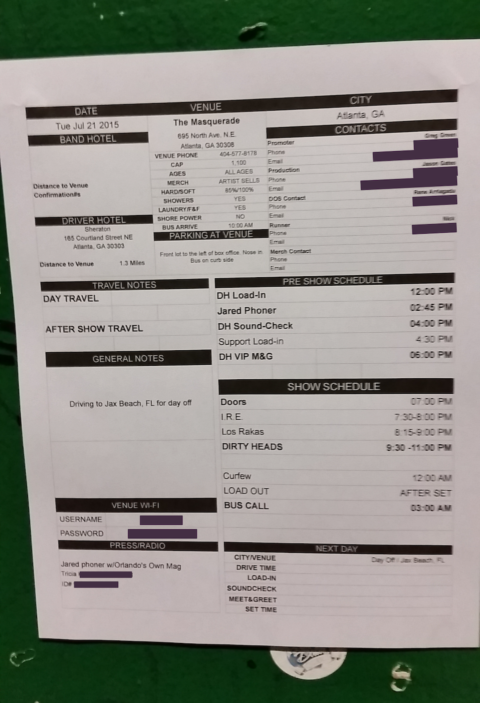
A multi-date tour quickly becomes an operations problem. Venue details live in email. Schedule changes happen in group texts. Routing sits in a spreadsheet. Lodging may exist only in someone’s notes. The most organized member usually absorbs responsibility for keeping everything straight, becoming the band’s unofficial tour manager by default.
That arrangement works until it doesn’t. When details change, there is no reliable shared surface showing which version is current. Band members ask the planner for information the planner has already collected, while the planner repeatedly becomes the interface between the tour and everyone else on it.
A dropped detail can cost more than inconvenience
A missing load-in time can make a band late. An unclear payout arrangement can create a settlement dispute. A lodging gap can become an unexpected expense after the show.
The consequences also extend beyond the road. Touring musicians may be coordinating jobs, families, transportation, and other commitments around dates planned months earlier. Uncertainty affects the whole band, even when only one person is responsible for maintaining the itinerary.
insight
I started by solving for the planner and found a band-wide information problem
I entered the project with deep domain familiarity, which was useful but also dangerous: I already had strong opinions about how touring worked.
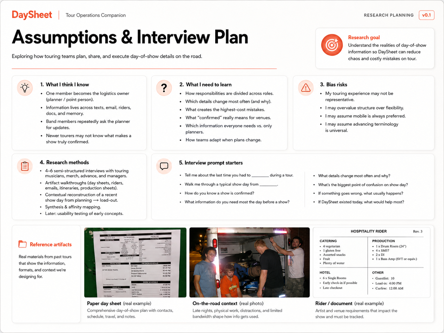
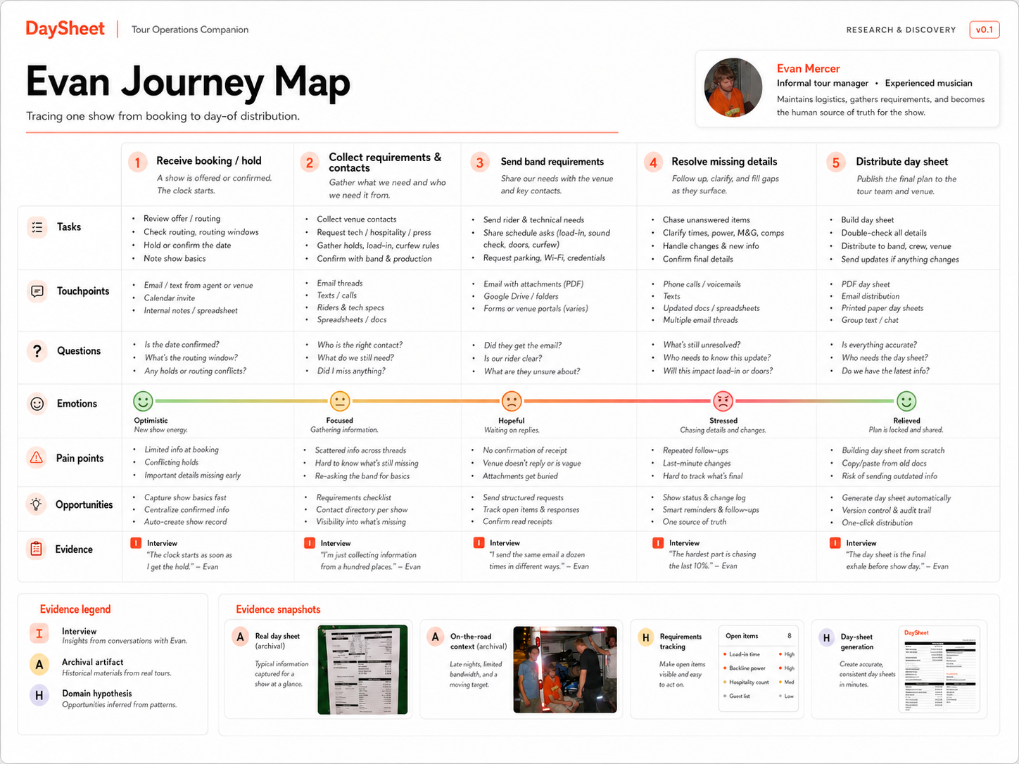
Rather than treating my own workflow as universal, I separated assumptions from user needs and modeled three distinct relationships to tour information. I developed domain-informed proto-personas, problem statements, and five-stage journey maps for each, then checked the journeys for accessibility needs and obvious design bias.
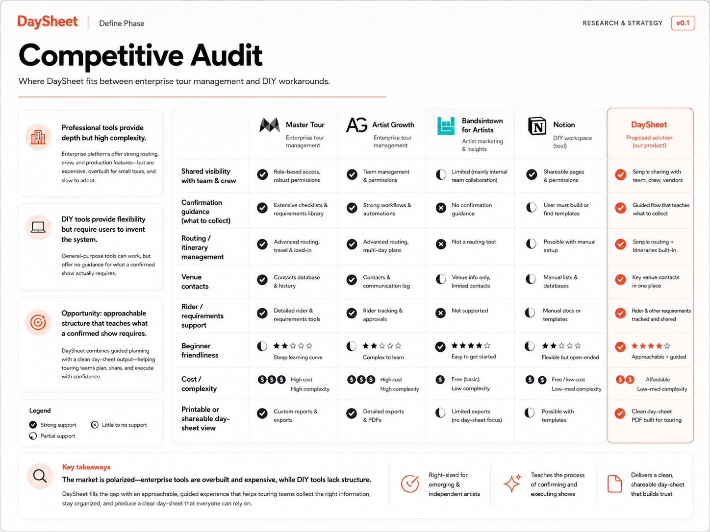
I also audited four different approaches already available to musicians: Master Tour, Artist Growth, Bandsintown for Artists, and general-purpose Notion workflows. Together they showed a market split between sophisticated professional tooling, promotional tools, and flexible DIY systems that still require users to build the touring logic themselves.
[Asset — Full Journey Map: Use the strongest of the three journey maps with actions, tasks, emotions, opportunities, accessibility considerations, and bias notes legible at full zoom.]
The band didn’t have an organization problem—it had a distribution problem
The planner was not necessarily failing to collect information. The system failed because everyone else’s access to that information depended on the planner’s availability. That reframed the product from “help one person plan a tour” to “give the whole band access to the same operational truth.”
[Asset — Competitive Audit: Matrix comparing Master Tour, Artist Growth, Bandsintown for Artists, Notion, and DaySheet across internal logistics, shared visibility, routing, confirmation guidance, expenses, cost/complexity, and beginner scaffolding. Caption: The opportunity sat between enterprise tour management and build-your-own productivity tools.]
A second insight pushed the concept further. Experienced tourers carry an internal checklist of what makes a date genuinely ready: venue contacts, timing, payout, lodging, technical details, and other dependencies. Newer musicians do not know which blank field is dangerous until experience teaches them.
A useful product therefore could not merely provide places to enter data. It had to carry some of the expertise itself.
Jobs to be done: Touring planners and musicians need to see what remains unresolved for every date so they can close gaps before they become road problems.

Evan

Riley

Theo
decision
I needed to choose how much structure the product should impose
The research synthesis pointed toward structure, but too much structure could turn DaySheet into exactly the kind of heavyweight touring software independent bands avoid. I considered three approaches:
- Flexible workspace — Let bands configure their own fields, views, statuses, and workflow, similar to a purpose-built Notion template.
- Simplified tour manager — Provide fixed modules for itinerary, lodging, routing, contacts, and expenses while leaving readiness decisions to the user.
- Guided tour model — Structure the product around Tour → Date → Advance and make each date progress through explicit readiness states based on the information entered.
Design tension: Experienced tourers needed speed and flexibility, while first-time tourers needed the system to tell them what they did not yet know.
I made structure do the teaching
I chose the guided model.
A blank canvas would preserve maximum flexibility, but it would also transfer the burden of defining a good touring system onto the person using it. That works best for the expert who already has a process and worst for the first-time user who needs the most help.
DaySheet instead treats Tour → Date → Advance as the product’s spine. Each show progresses through Hold → Advancing → Confirmed, while the information required at each stage makes the hidden checklist visible.
The tradeoff is intentional. Edge cases such as fly dates, split bills, unusual routing, and hybrid tour formats may eventually require more flexible modeling. I accepted a narrower first version in exchange for making the core touring workflow easier to understand and harder to accidentally leave incomplete.
[Asset — Decision Diagram: Three option cards feeding into the design-tension statement, with Guided Tour Model visibly selected. Follow with a simplified Tour → Date → Advance diagram.]
Gallery
I turned three relationships to tour information into product requirements
The proto-personas were useful because they described different relationships to the same data rather than arbitrary demographic segments.
Evan creates and maintains information. Riley consumes and depends on it. Theo does not yet know what complete information looks like.
Their journey maps translated those differences into recurring product requirements:
- Shared read access should be a first-class experience, not a reduced manager view.
- Missing information should be surfaced rather than discovered through manual auditing.
- Day-of information should be fast to retrieve under real touring conditions.
- Important changes should reach members without creating notification noise.
- Guidance should explain unfamiliar logistics without talking down to experienced users.
I put show readiness into the information architecture
The central interaction became a state model rather than another checklist floating beside the itinerary. A Tour contains individual Dates. Each date contains an Advance: the operational information required to play that show. Status communicates how trustworthy that date currently is.
- Hold means the date exists but is not locked.
- Advancing means the show is moving forward but important details remain unresolved.
- Confirmed means the critical information required for the date has been completed.
That structure gives the interface a consistent answer to two questions: What is happening? and What still needs attention? The same model can then drive dashboard status, individual show views, reminders, and eventually validation rules.
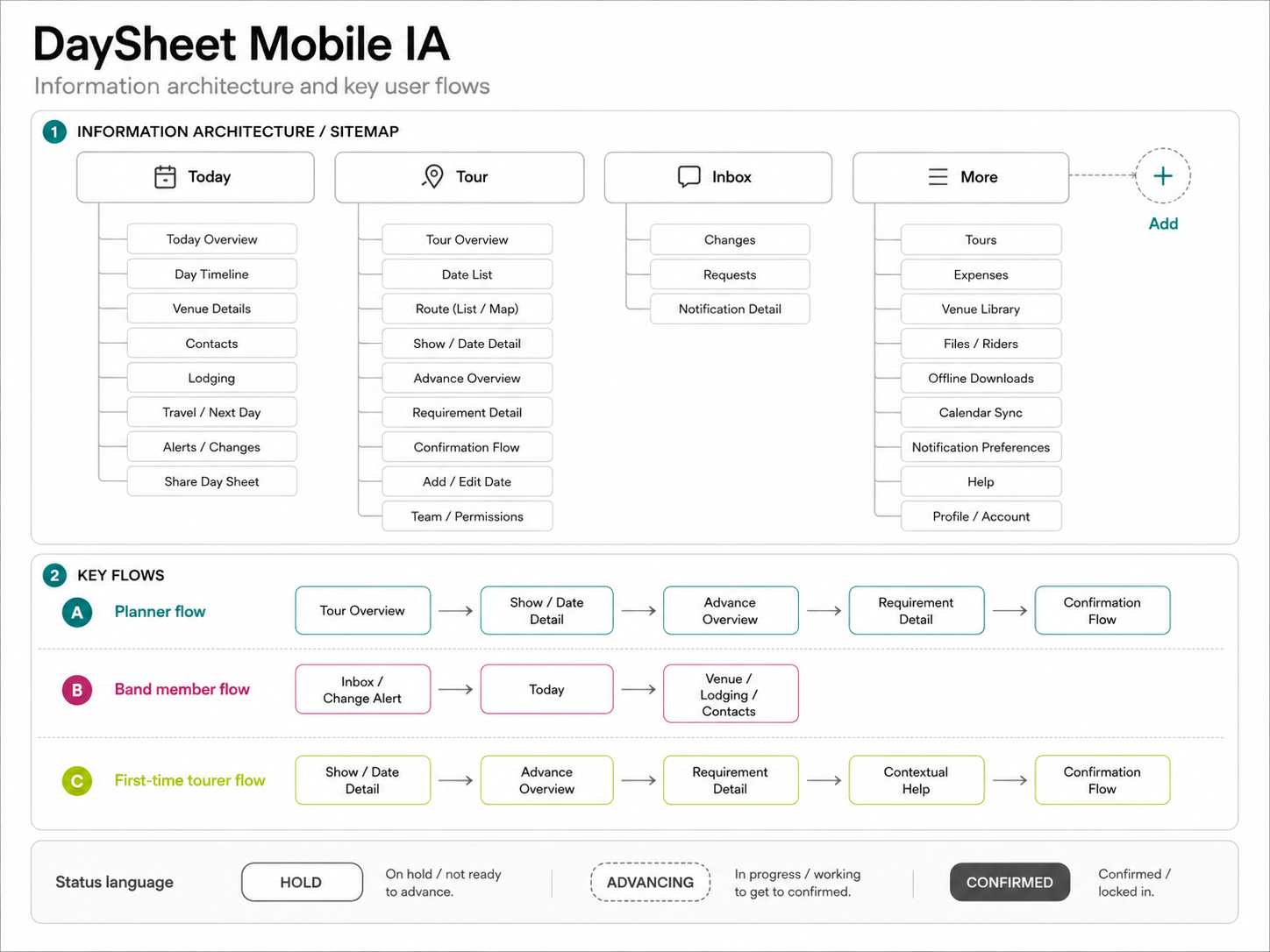
[Asset 1 — Object Model / IA Diagram: Tour → Date → Advance, showing linked data such as venue, contacts, schedule, lodging, routing, and finances.]
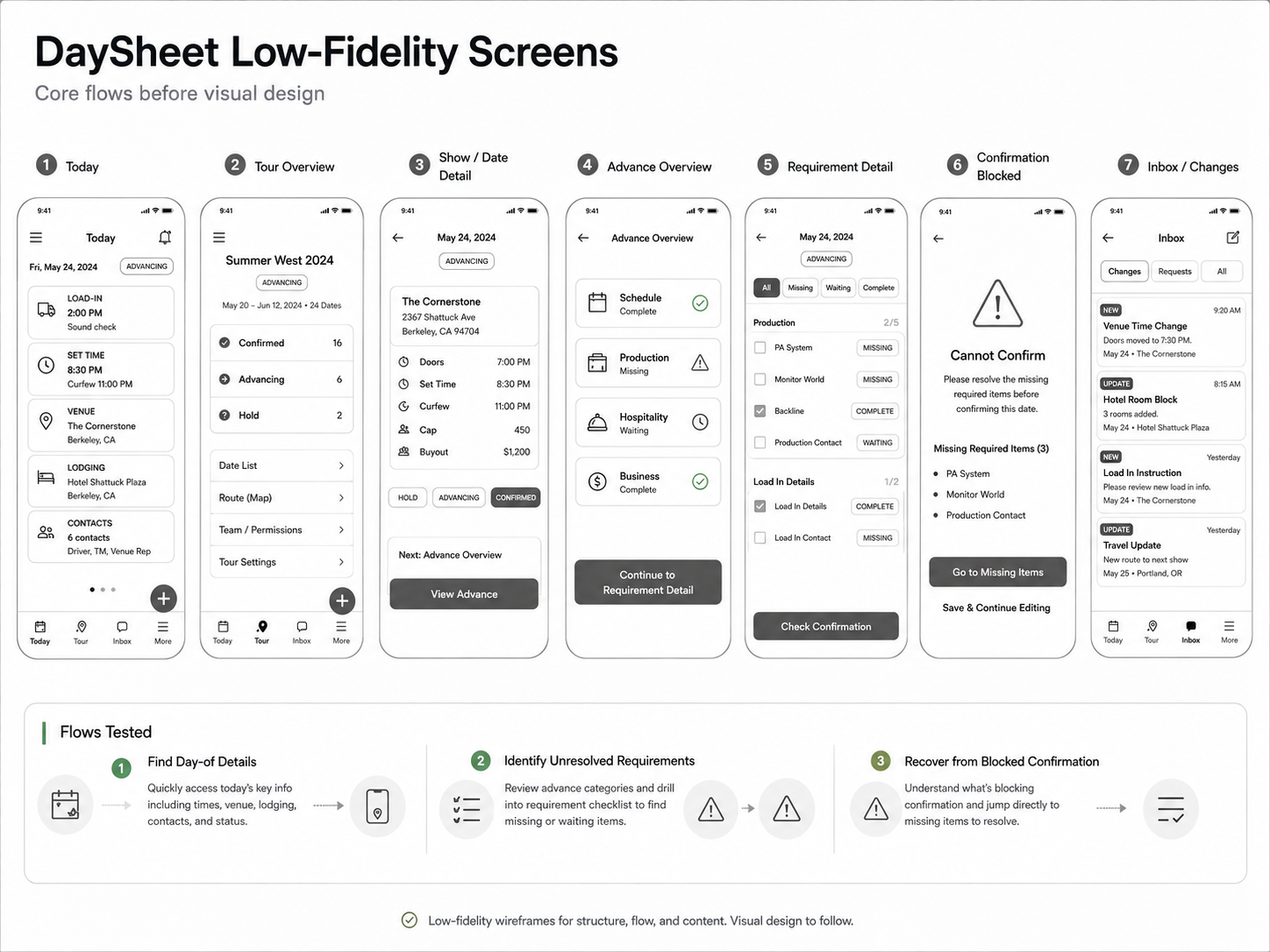
[Asset 3 — Paper → Lo-Fi Progression: Early sketches beside low-fidelity wireframes. Caption: I tested whether structure felt like guidance before spending effort on visual polish.]
I designed the day sheet for a parking lot, not a desk
Tour information is often checked while loading gear, sitting in a van, walking into a venue, or working with unreliable service. That shifted the interface priority from “manage everything” to “show me what matters right now.”
The Today view brings the most time-sensitive information into one surface: venue, address, contacts, load-in, set time, lodging, and current confirmation state.
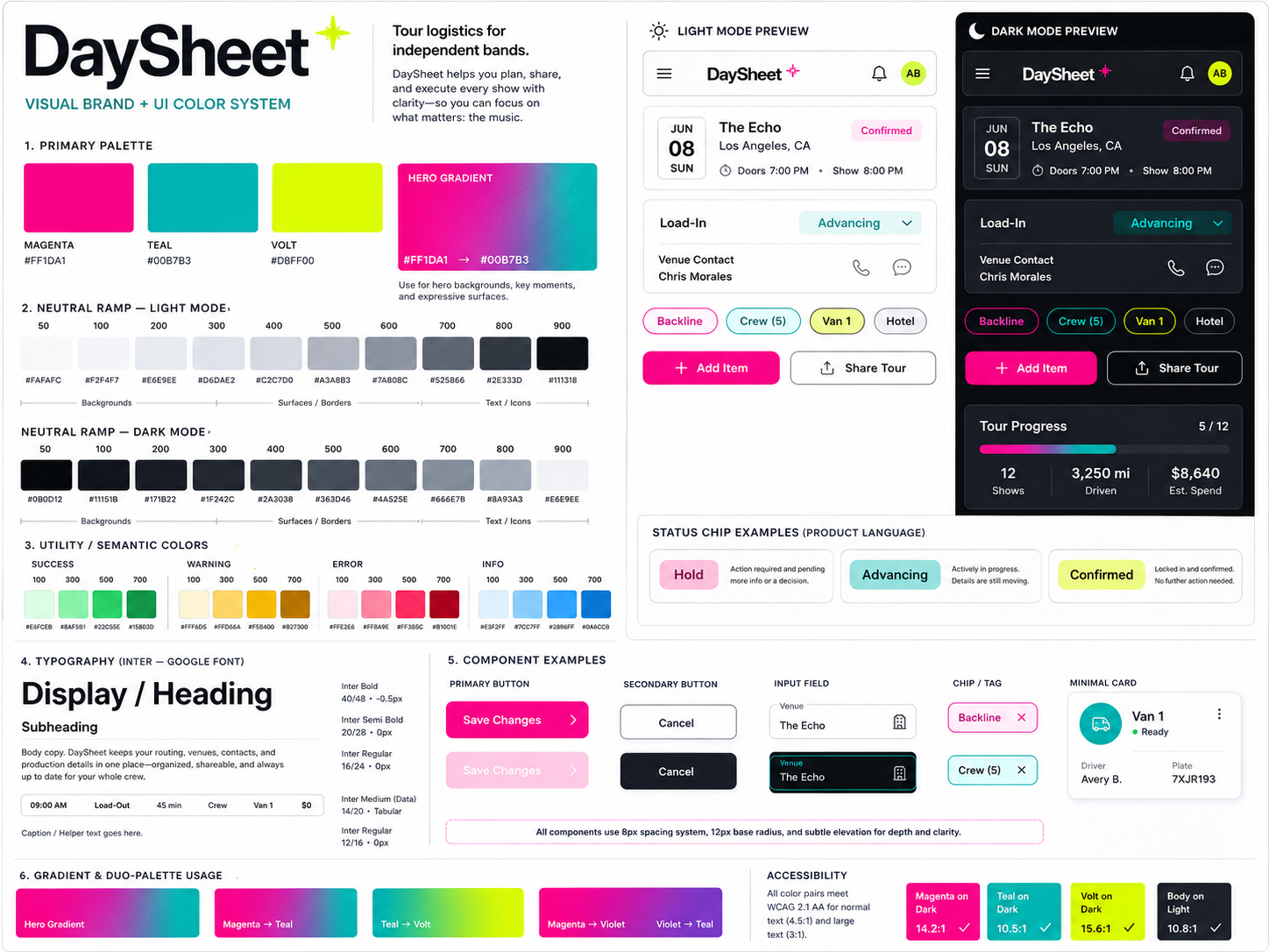
The Hold / Advancing / Confirmed system carries that state throughout the product. Status should never depend on color alone, so the final component system should combine text, iconography, shape, and color with sufficient contrast and scalable typography.
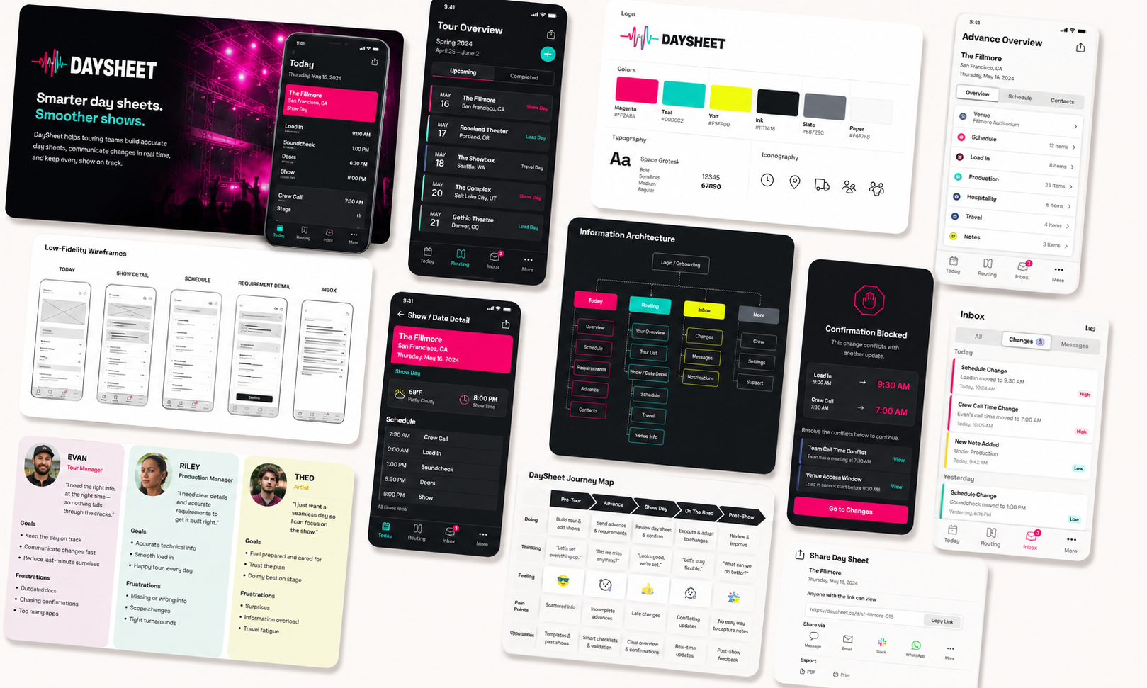
A lightweight design system keeps the mobile and responsive-web experiences recognizably part of the same product without overbuilding a concept-stage library.
[Asset 2 — State-System Specimen: Hold / Advancing / Confirmed component variants, including icon, label, color, accessibility states, and any plain-language supporting text.]
[Asset 3 — Responsive Pair: Same tour/date content shown on mobile and desktop. Caption: The phone optimizes for retrieval on the road; the larger layout gives planners more room to advance multiple dates.]
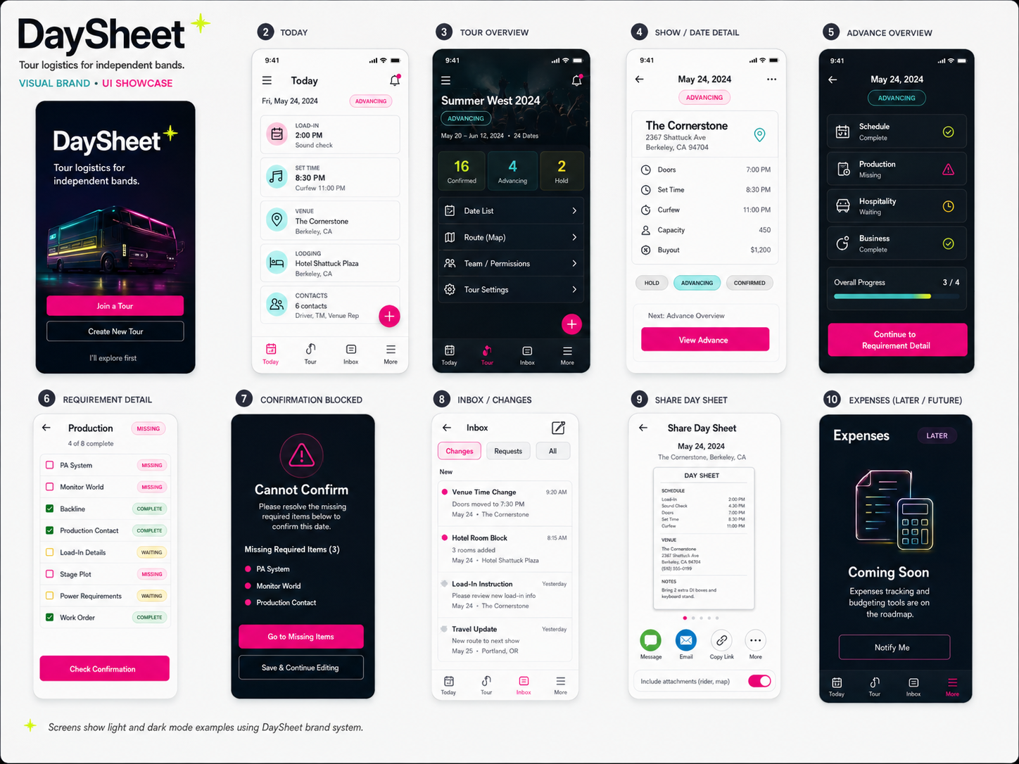
I made the core hypothesis interactive before treating the interface as finished
The highest-risk idea in DaySheet is not the visual design. It is whether structured status actually helps users understand what is ready, what is missing, and what to do next.
The prototype therefore centers on a small number of consequential flows rather than trying to simulate the entire future product:
- finding day-of information;
- reviewing the status of an upcoming date;
- identifying missing details;
- adding or updating advance information;
- understanding when a show is ready to be treated as confirmed.
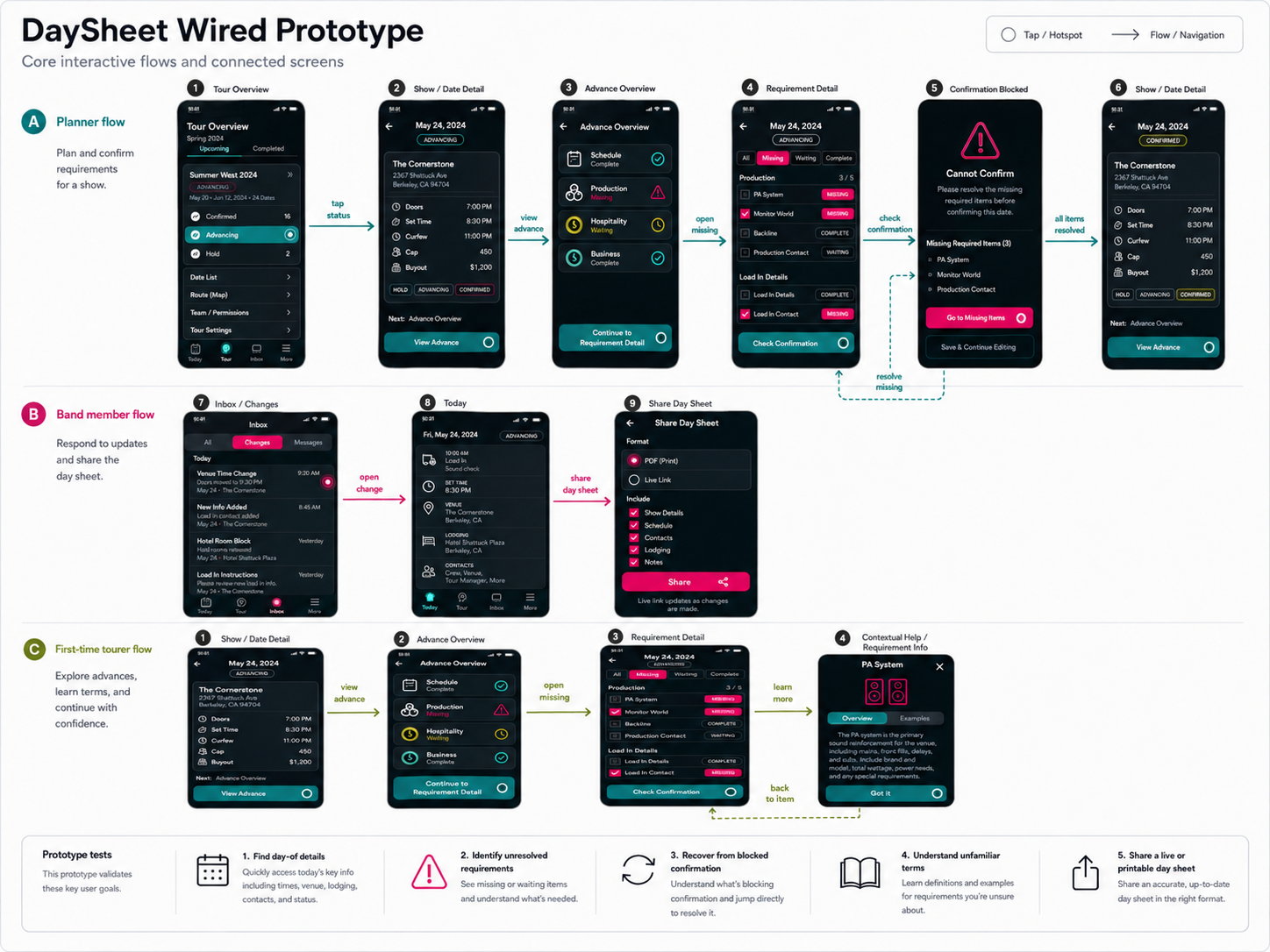
[Asset 2 — Confirmation Flow: Side-by-side frames showing an incomplete date, missing-information guidance, and resolved state.]
[Asset 3 — Prototype Scope Diagram: “Built / simulated / deferred” view showing which product areas were included in testing and which remained conceptual.]
Delivery
I scoped the concept around the question I most needed to answer
Because DaySheet was a solo concept rather than a production engagement, delivery was primarily an exercise in scope discipline.
The competitive audit surfaced many plausible features—routing optimization, calendars, budgeting, expense splitting, reusable venue contacts, notifications, and post-tour reporting. Building all of them would have produced a larger prototype but a weaker experiment.
I kept the primary product slice focused on the shared itinerary and confirmation model because those features test the central thesis: can structure reduce dependency on the planner while helping less-experienced users recognize what they still need to know?
The remaining features form a logical backlog rather than pretending to be validated parts of the solution.
My domain expertise was also a source of bias
I had an unusual stakeholder problem: I already knew too much about the domain. Touring experience helped me recognize jargon, edge cases, and logistical dependencies quickly, but it also created the risk that I would design around my own habits and call them user needs.
I addressed that by keeping assumptions visible, deliberately including the first-time-tourer perspective, checking journey maps for bias and accessibility, and treating usability testing as an opportunity to challenge the model rather than confirm it.

Validation
I tested whether users could understand the structure without my expertise
The evaluative study should focus on the interaction hypotheses established earlier in the case rather than broad product preference. Core tasks should test whether participants can:
- determine the status of an upcoming show;
- find a specific day-of detail without asking the planner;
- recognize which information is still missing;
- understand what must happen before a date is ready;
- recover when attempting to complete a flow with missing information.
The study should also watch for terminology problems, differences between experienced and inexperienced tourers, expectations around editing versus read access, and any assumptions the design makes about how bands divide responsibility.
[Asset 1 — Usability Study Plan: Participant criteria, tasks, hypotheses, and success measures.]
[Asset 2 — Affinity Map: Actual observations grouped into themes after testing. Caption should name what was observed, not what was expected.]
The evidence has limits
This is a concept project, so evaluative testing can establish whether the proposed interaction is understandable and usable. It cannot demonstrate market demand, retention, financial impact, or adoption.
The participant sample should also be interpreted in context. Recruiting only from my own music network would make testing practical but would overrepresent the touring norms I already know. A wider study would need musicians from different scenes, business models, experience levels, and types of touring work.
IMPACT
The most important result is whether the structure teaches
The strongest evidence would not simply be a high usability score. It would be behavior showing that users could recognize incomplete dates, understand what remained unresolved, and recover without needing the designer to explain the touring model.
Publishable metrics may include:
[XX / XX tasks completed]
[Methodology: define participants, tasks, and what counted as successful completion.]
[XX seconds median time to locate a day-of detail]
[Methodology: define task and timing boundaries.]
[SUS XX / 100]
[Only if SUS is actually administered; provide sample size and benchmark context.]
[XX / XX users recovered from an incomplete-confirmation state without moderator help]
[Use only if this scenario is tested.]
[Asset — Proof Figure 1: Task-completion or time-on-task visualization using the same visual grammar as the proof figures in the other portfolio cases.]
[Asset — Proof Figure 2: SUS or another legitimate evaluative measure, only if collected.]
Did the design answer the needs I started with?
The underlying success measure remains simple: how often does a band member still have to ask another human for information the product should already provide? In a production version of DaySheet, I would instrument that “ask rate” indirectly through information-retrieval behavior, unresolved fields, repeated searches, notifications, and support feedback.

Evan
Riley
Theo
REFLECTION
A familiar logistics problem and became a design lesson about expertise
Many products assume users already understand the process the software supports. That works until inexperience itself becomes the risk: onboarding a client incorrectly, skipping a compliance step, misunderstanding a financial workflow—or arriving at a venue without information an experienced tour manager would have known to confirm.
The more durable principle is: When the user’s inexperience is part of the risk surface, don’t merely document the expert’s checklist. Encode it into the product.
For DaySheet, that meant turning “confirmed” from a subjective label into a meaningful state grounded in the information behind it. It also reinforced the difference between knowing a domain and researching it. Experience gave me a faster starting point, but good UX work still required making assumptions explicit enough to challenge.
What I'd do differently next time...
If I continued the concept, I would widen the evidence before widening the product:
- Recruit outside my own music network. A DIY club tour, a wedding circuit, a regional cover band, and a support act can operate under very different assumptions.
- Stress-test the object model. Fly dates, split bills, festival appearances, and irregular routing would show where Tour → Date → Advance needs to bend.
- Test financial workflows earlier. Money introduces permissions, privacy, trust, and settlement questions that may matter more to adoption than itinerary management.
- Instrument the ask rate. The product succeeds when information stops having to travel through one human being.
- Validate demand separately from usability. A usable concept is not automatically a viable product; the next research phase should determine whether the problem is painful and frequent enough to justify changing existing band workflows.
[Asset — Reflection / Evolution Figure: Compact “Now → Next” diagram showing validated interaction questions on the left and future product/research questions on the right.]